Nanazoca
Acrobat
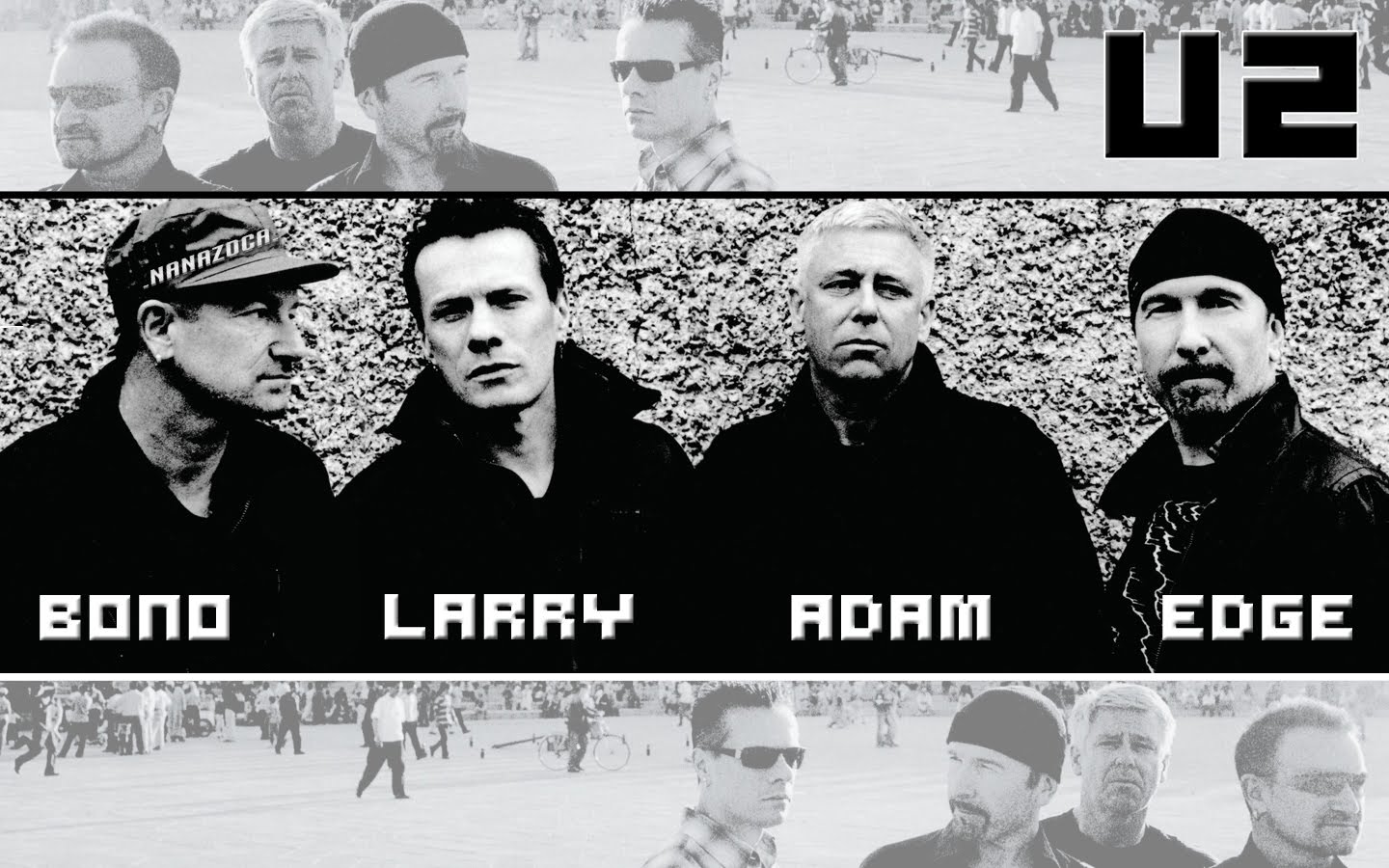
Some wallpapers
Some wallpapers I created:
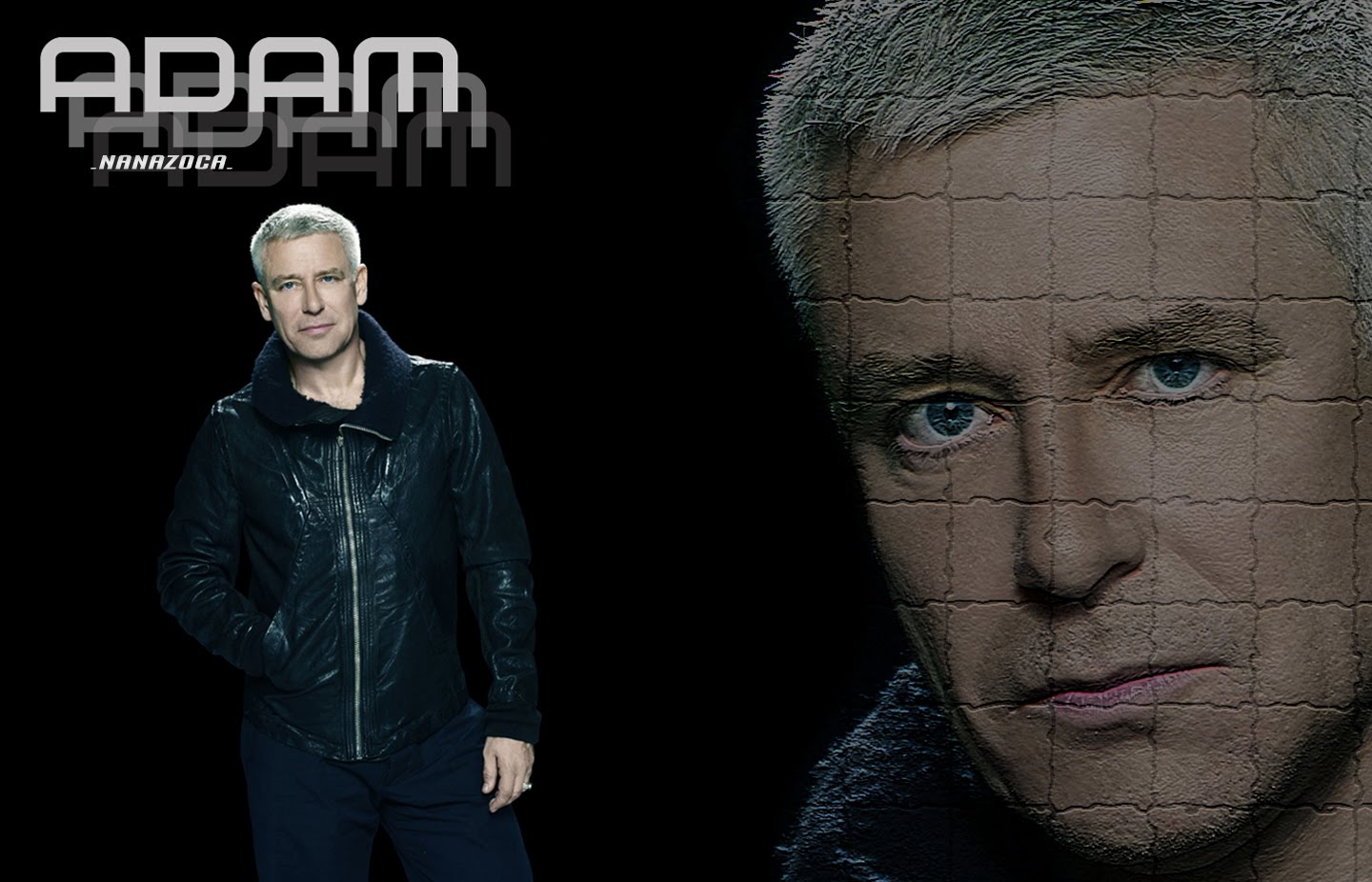
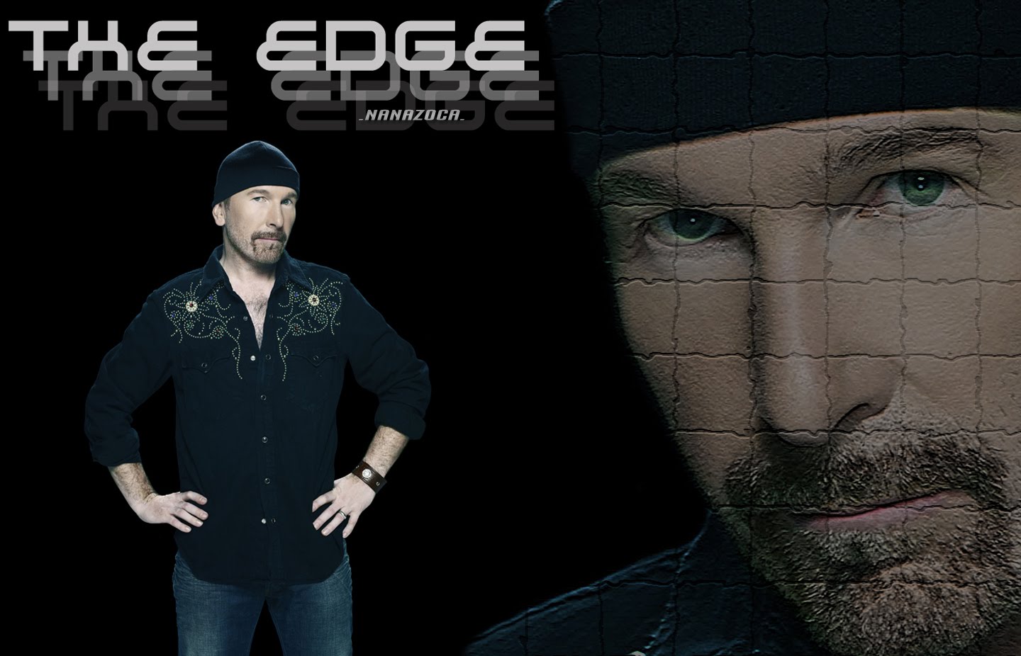
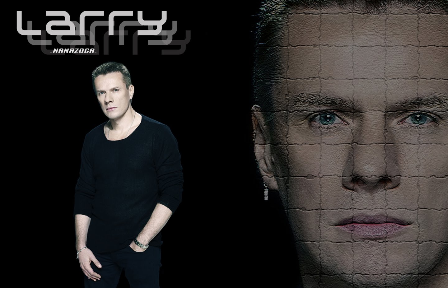
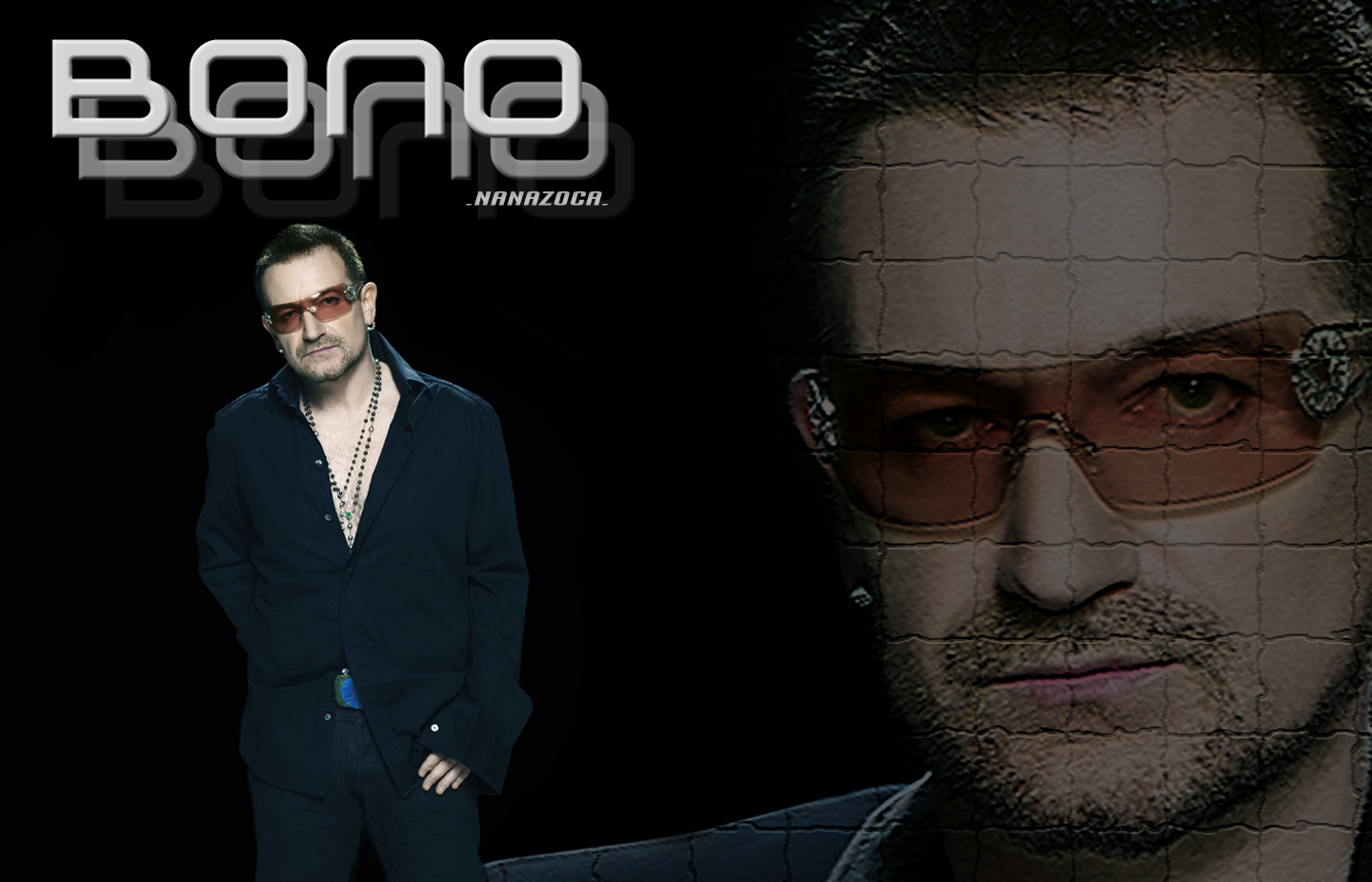
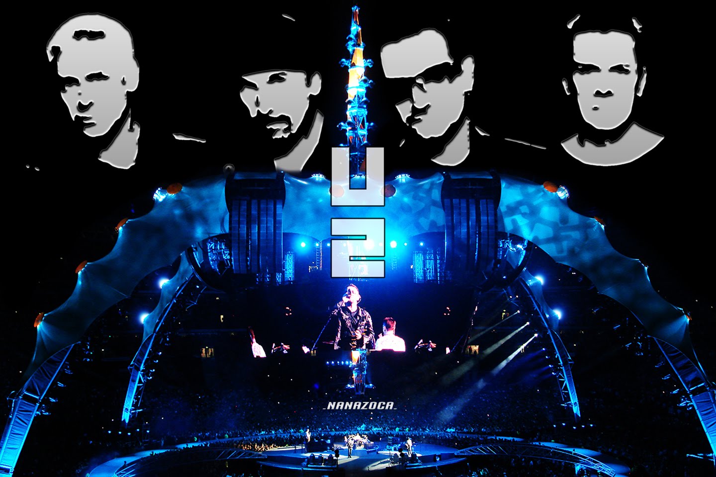
Some wallpapers I created:
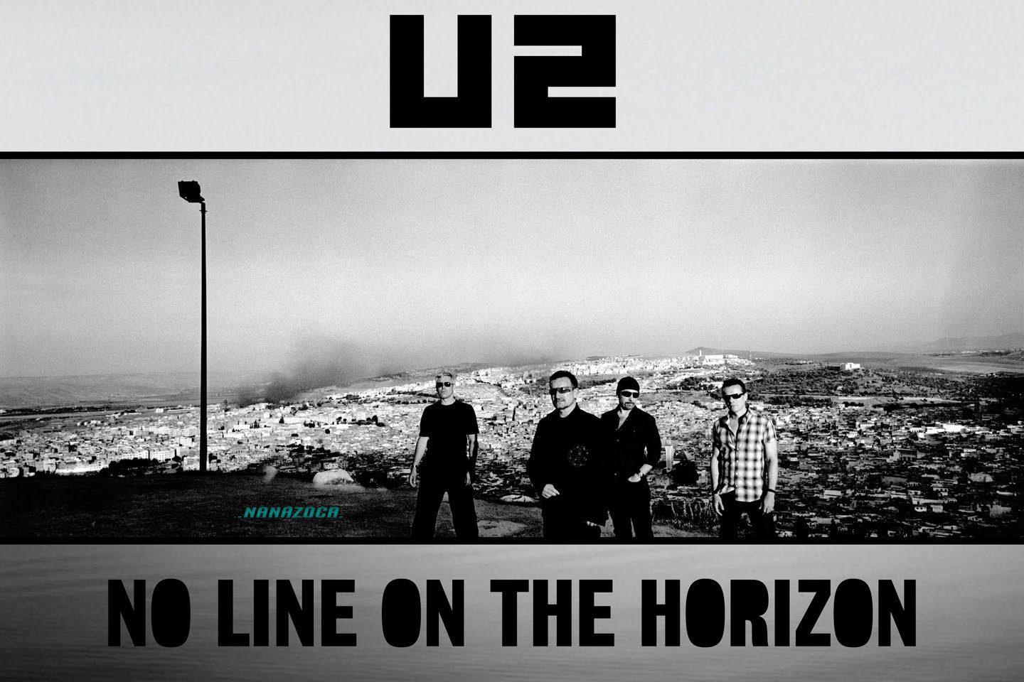
Some wallpapers I created:
those are awesome! Do you have the original pic of Edge? I don't think I've seen that pose before.


Great job,Nanazoca!Nice to see you here
thanks sweet...I thought I had an account here but I was wrong, so I created it yesterday lol
I´m happy to be here
Andréia eh parceira de twitter! kkkkkk
One coment in portuguese...
É O BRASIL DOMINANDO O PLEBA
kkkkkkkkkkkkkkkkkk
É nos Nanazoca, Chará e eu \o/


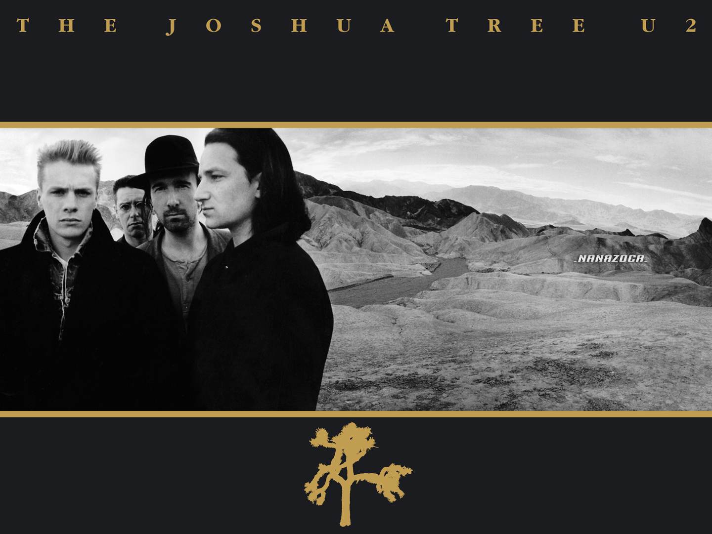
Of course...I have a lot of these photo sessions and I uploaded all of them on U2 start.com | Photos and I´ll post more photos from no line on the horizon photo sessions.

Nothing new here. Need to get off my arse.
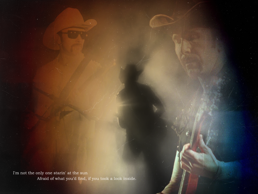
Click for full size (1024x768)
I love that wallpaper Nothing new here. Need to get off my arse.

Edge , could I ask you witch fonts you used for the text part and beneath the tour logo ?
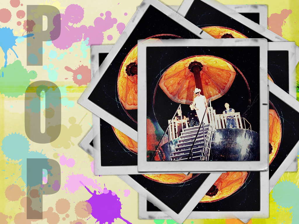
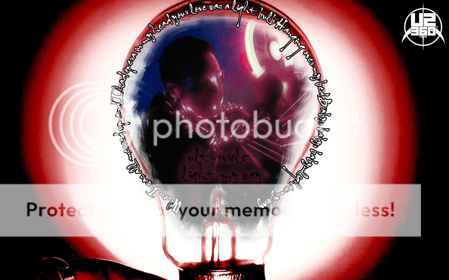
Here's another one of my contributions.
This time Ultraviolet 360° meets the Achtung Baby artwork:
Only avaliable in 1440x900 I'm afraid since that's my own resolution.
I found that similar looking font again and wanted to give it a spin.

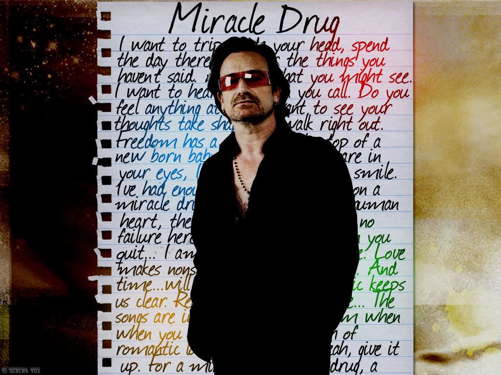
 I'll send you an Email! Thankyou so very much , you made me very happy today Awesome BG's Edge.!!!
Thank you. It's my favourite one too.Miracle drug
Many moons ago.So you made this one? I love this wallpaper. You´r very good!! Nice to meet you
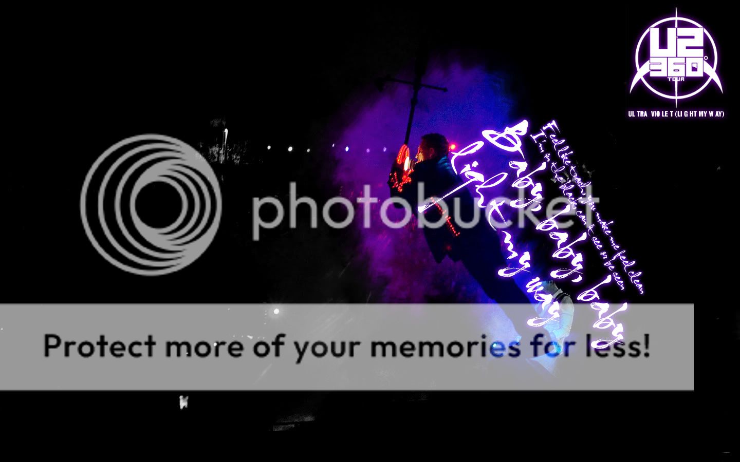
I made yet another one, a bit more Achtung-esque:
Nothing new here. Need to get off my arse.
Click for full size (1024x768)
I like it but I don't think the text wrapping along the lightbulb looks very good. Looks like you used a very thin outline. I think it would look really good if the outline were a little thicker and the opacity of the text layer itself was lowered some, or if other effects were used on it.
Just my opinion though. To reiterate - I think it's a great wallpaper! I'm just not keen on the text.
I appreciate feedback, positive or less so, that's how I learn.
I agree with what you said about the text, it occured to me when I posted it here but by then I had already flattened it and closed down Photoshop. I rarely save .psds for small stuff like these so I just let it be the way it was.
I should've moved the text a little bit so it starts a little more to the lower left rather than at the center of the lightbulb like this. Thanks!
I made yet another one, a bit more Achtung-esque:
 thanks