You are using an out of date browser. It may not display this or other websites correctly.
You should upgrade or use an alternative browser.
You should upgrade or use an alternative browser.
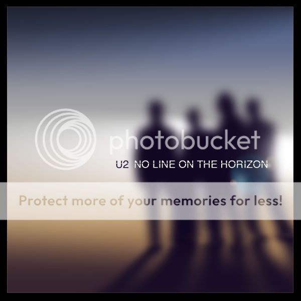
Post your fake album art
- Thread starter LemonMelon
- Start date
The friendliest place on the web for anyone that follows U2.
If you have answers, please help by responding to the unanswered posts.
If you have answers, please help by responding to the unanswered posts.
elevated_u2_fan
Blue Crack Supplier
tkramer
War Child
Regarding the kid/wet pavement shot: I doubt that's the album cover, the letters aren't remotely in proper perspective.
last unicorn
Blue Crack Addict
Where does that kid cover come from anyway?
It looks cool.
It looks cool.
bonocomet
Blue Crack Distributor
 Am I the only one that doesn't like that cover with the kid? I don't know, I prefer the ones more like david's myself.
SamuelSmeloc
War Child
Am I the only one that doesn't like that cover with the kid? I don't know, I prefer the ones more like david's myself.
No, I don't like too... The U2 logo on the shirt is pretty strange.
Where does that kid cover come from anyway?
It looks cool.
Well, I found it on a brazilian fan-site... the poster said that it came from orkut.
Meh, but yeah, t does looks cool.

BoyOnTheHorizon
Refugee
I still think this is the best so far... ethereal, mistic, as the songs should be.

bonocomet
Blue Crack Distributor
Yeah I like that one too 

Zooropa man
Refugee
Where is the still from that video Larry made a while back... the one on U2.com. The video of the "Horizon"...?
dan_smee
ONE love, blood, life
^ we can all agree the boy one is a fake. I think that, with such a descriptive and image provoking title, it HAS to be a picture of the sea and sky melting together
LyricalDrug
Rock n' Roll Doggie
The sea-to-sky melty covers are all cool, but the idea is too obvious for that to be the actual cover, you know? Although I guess they did kind of have a Joshua Tree on the cover...
bonocomet
Blue Crack Distributor
Well it was on the back cover wasn't it... or was it inside.. (I forget) 

DreamOutLoud13
Blue Crack Addict
Outline on the back cover (and on the CD/record itself), and photo inside the liner notes. But no trees on the front, just U2's ugly mugs.Well it was on the back cover wasn't it... or was it inside.. (I forget)
bonocomet
Blue Crack Distributor
Thanks  I'm at work and it's one of those things that I've seen so many times but still couldn't remember, I knew it wasn't on the front though

dan_smee
ONE love, blood, life
^ it may be obvious, but theyve never before had a title that was so descriptive of a physical thing/landscape.
I mean Boy, and there was a boy on the cover.
October - cant really take a picture of "october"
War - Boy in war helmet looking pissed
TUF - a castle
TJT - band in desert in and around a joshua tree
R&H - band on stage
AB - wall art
Zooropa - purple shit
Pop - popart photos
ATYCLB - at an airport - symbolism alludes to title
HTDAAB - band looking like paedophiles
NLOTH - Has to be a good photo of the beach or whatever. It may be obvious, but its completes the image. If it is to be a proper album, not just a collection of songs, the cover matters. Plus it doesnt make sense to have anything else
Tacvbo
The Fly
- Joined
- Aug 5, 2008
- Messages
- 223
HTDAAB - band looking like paedophiles

I really like this fake cover, it's like they're closing the cycle, with the image of the boy....
PowerSurge
New Yorker
Zooropa - purple shit

wha????
I thought it was like a demented looking flag for the "nation of Zooropa" or something like that.
dan_smee
ONE love, blood, life
yeah, something like that, but its purple. And I tihnk the purple bits are distorted song titles in some wierd font, but iof you just look at uit in passing - purple shit
Edit: not saying that the cover IS shit, just saying purple shit using shit as a generic term to describe an indeterminate object, not physical shit.
Edit: not saying that the cover IS shit, just saying purple shit using shit as a generic term to describe an indeterminate object, not physical shit.
LemonMelon
More 5G Than Man
dan_smee
ONE love, blood, life
love the album, worst cover ever. Maybe if it had a good cover people would like it more???
LemonMelon
More 5G Than Man
What's sad is that the rest of the album art isn't that horrible. They could have picked any other photo for the cover and it would have been better.
love the album, worst cover ever. Maybe if it had a good cover people would like it more???
Worst cover ever? Are you sure?

dan_smee
ONE love, blood, life
Worst cover ever? Are you sure?

for some reason the image you posted isnt coming up?
dan_smee
ONE love, blood, life
haha, i think thats better than HTDAAB...
LemonMelon
More 5G Than Man
dan_smee
ONE love, blood, life
omg, 31!
LemonMelon
More 5G Than Man
omg, 31!
#18 looks like the kind of album Pitchfork would hail as a lost classic.
Similar threads
- Replies
- 36
- Views
- 3K
- Replies
- 1
- Views
- 386
- Replies
- 1
- Views
- 448
Latest posts
-
-
-
Ongoing Mass Shooting Thread #3... that's right, a third thread. Because 'Murica.
- Latest: MrsSpringsteen
-
-
-
-
-


