phanan
Blue Crack Addict
Anything would beat HTDAAB.
Anything would beat HTDAAB.
If this is legit, it's both disappointing and a relief. I've been looking at variations of this for months, but it could have been 10 times worse.

I like it personally and I agree with the idea of having no title at all, just the picture...
Although, I can’t see them actually doing that.
Sounds like something you would read on the back of a box of herbal tea.

I like it personally and I agree with the idea of having no title at all, just the picture...
Although, I can’t see them actually doing that.

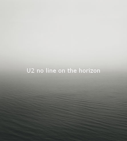
the link doesnt say THAT particular photo is the cover, only that one of Sugimoto's photos might be. looks like there's a series of these sea/sky photos in his portfolio
 Haha the best cover ever. I like the rumoured cover by the way. This would be a departure
Nice if true. The lack of the band makes me doubtful they'd use it.
Why is Bono's right arm not sticking out of his sleeve?
Anything would beat HTDAAB.


Ok, I'm not a big Hutdab fan, but why is it that people hate that cover so much? Please, I want to know. Give me like 5 or 10 reasons, cause I don't see anything particularly pleasing or offending about it. It's just a bunch of dudes sitting down for a photograph, and the black and red emphasize the directness of the songs.
^ thr problem with HTDAAB cover is manyfold:
1. band on cover
2. no theme, just photo of the band (JT at least had a theme)
3. black and white photo to give the impression they have tried
4. generic colouring border (red and black to fool emos into buying it)
5. EVERY ONE OF THEM LOOKS LIKE THEY HAVE ICE-CREAM SANDWICHES IN THEIR BACK POCKETS TO LURE CHILDREN TO THEIR GINGERBREAD HOUSES
6. Edge holding his genitalia
7. Bono's OBVIOUS photoshopped head
8. Larry doesnt look totally bored (obviously very fake)
9. it sucks
10. we waited for years for that
11. it didnt suit the music
12. it didnt suit the title
Well it's about time the band was missing from the front cover,don't you think?............and remember there's always the back cover that they could put themselves on
Ok, I'm not a big Hutdab fan, but why is it that people hate that cover so much? Please, I want to know. Give me like 5 or 10 reasons, cause I don't see anything particularly pleasing or offending about it. It's just a bunch of dudes sitting down for a photograph, and the black and red emphasize the directness of the songs.
And I'm calling it: the band won't be on the album cover. I'll pay each member of Interference $5 if I'm wrong. Bam.

well i was hoping for color this time, but given the title, i suppose another b/w cover is sort of required.
i was sort of hoping for something bluish. looking at u2's covers, you get they sense that they aren't particularly fond of color photos.
would this be the first time since ??? that anton corbijn hasn't done the cover art?
he def did / or at least took photos for everything going back through war (with the exception, maybe, of rattle and hum?)
anyway... that cover looks cool. would look nice on a display with a bunch of them shelved together. very iconic.
Ok, I'm not a big Hutdab fan, but why is it that people hate that cover so much?

