last unicorn
Blue Crack Addict
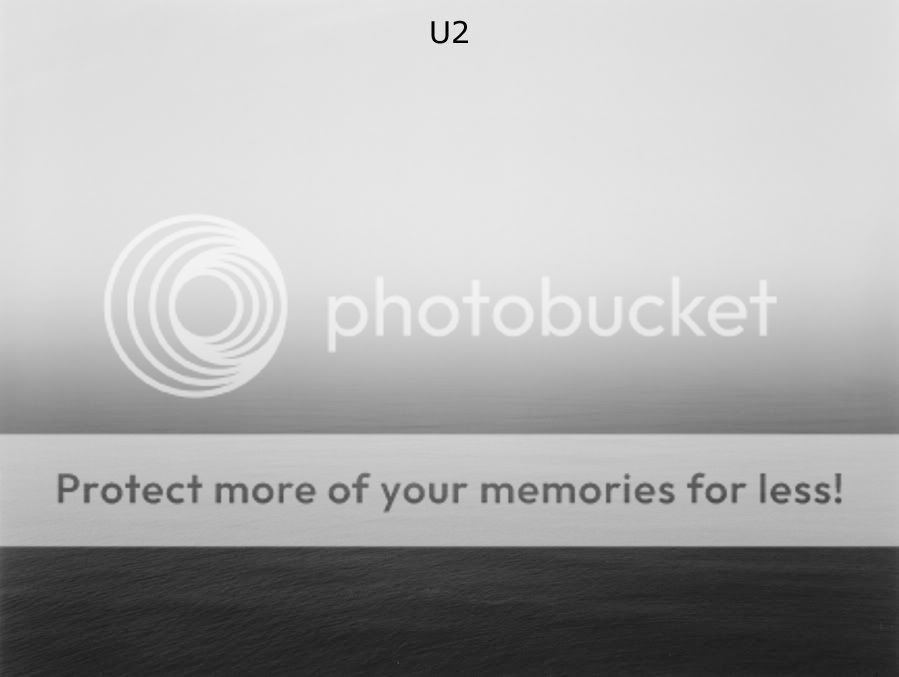
I like it because it's simple, because it's simple in color and message. I don't want a cover that is over-loaded with different images, colors and stuff, that's too much. I like the photograph, just look at the texture of the water in the front. It has something melancholic about it. I would prefer this WITHOUT any writing on it.
BUT there is one thing I'd say against it: It's too obvious. While part of me wants a simple sea/landscape/nature cover, I just think that it would be too obvious in combination with the album title.
But I'd prefer that one over a band photo or any form of visual overkill.
BUT there is one thing I'd say against it: It's too obvious. While part of me wants a simple sea/landscape/nature cover, I just think that it would be too obvious in combination with the album title.
But I'd prefer that one over a band photo or any form of visual overkill.


")


