Confirmed Album Cover - Grey Boxes Are? / U2 Album Cover Rip-Off?

The friendliest place on the web for anyone that follows U2.
If you have answers, please help by responding to the unanswered posts.

What are those grey boxes?

  • Boxes = Text Placeholder

    Votes: 88 27.5%
  • Boxes = Something Else Open Interpretation

    Votes: 164 51.3%
  • Boxes = Nothing

    Votes: 68 21.3%

  • Total voters
    320
  • Poll closed .

BWU2Buffs

War Child
Joined
Dec 15, 2002
Messages
918
Location
Omaha, NE USA
Arguably, this thread will be redundant, but I’m bored, and I want to put it to a vote.

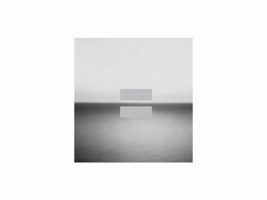
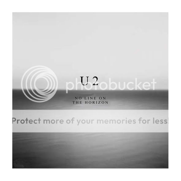
Some of us think that the new confirmed album “artwork” has two grey boxes that will eventually simply hold text.

Others are speculating that the two boxes will NOT hold text and have offered up interesting ideas and grey box interpretations, fair enough.

I like the picture.

I don’t think the album cover is complete and if those boxes don’t eventually hold text that at least says “U2” I will personally be very surprised and commit to delaying my album purchase by one day if I’m wrong.

(How does a band that expressly wants to grow its fan base appeal to newbies AND leave their name off the album that is 5 full years past their last album?)

So, what do you think?
Grey Boxes = Text Placeholder i.e. U2
Grey Boxes Mean Something Else Open to Interpretation i.e. land, sea, heaven, hell, ying, yang, what, ever
Grey Boxes Mean Absolutely Nothing i.e. a cool image gets blemished for no reason

Vote, have fun, describe your rationale.

Losing side submits to suffering one more day without the album or eating
just a little Blue Crack crow.:wink:
 

Attachments

  • GBCOVER.GIF
    GBCOVER.GIF
    62.9 KB · Views: 10
Ideally, I prefer the image with no text and no bars. Just the image. However, since that is likely not going to happen, I would rather have there be text- U2 & NLOTH- than for the bars to just be there randomly. My bet is that text eventually does appear.

Though any of the above option beats having the band on the cover.
 
I personally think that putting text where the boxes are - something like this:

nlothcover4.jpg


...would be disappointing, boring and disrespectful to the artwork. The artwork is the picture WITH the lines...
 

It might have already been mentioned before so apologies to whomever, but if that's what U2's thinking of, the album cover idea sounds reminiscent of that Rene Magritte art that showed a picture of a pipe with the caption "This is not a pipe".
 
^ "The Treachery of Images (This Is Not A Pipe)" by Rene Magritte...

Yeah, I'm getting a surreal vibe off the artwork alright... Nice comparison!
 
If they want to convey sea/sky or some sort of "no line" significance, I have no problem with that. I have a problem* with it looking like a giant equal sign in the middle of the cover.


*no, when I say "I have a problem," I don't mean I have an actual, real problem with it.
 
Why in the hell would they emphasize the bars in the picture on U2.com? And why would they post a picture with text placeholders TO THE WEBSITE? Makes no sense at all.

It's an = sign.
 
But the fact that it reads as an equals sign is hugely significant! (apparently!)
Just go read some of dan_smee's posts on the other thread! He's really getting into this... And I tend to agree with just about everything he's said... It's great to have something to really get our teeth into...
 
But the fact that it reads as an equals sign is hugely significant! (apparently!)

After reading the last few pages of the other thread, I have to say I understand the significance of the equal sign (assuming that's what it's supposed to be).

I'm not saying I'm thrilled with the cover, but it helped to find an explanation that "clicked" with me.

Still more concerned with the actual content of the album, however. ;)
 
And why wouldn't they just put the text in??? They know the name of their band. They know the name of their album.

I really can't picture them sitting around saying "Hmmm...SHIT! Times New Roman or Courier Bold??? We can't decide yet just post the cover on the website...with gray boxes where the font will go!"

Makes no sense at all.

It's an awesome album cover :up:
 
I really can't picture them sitting around saying "Hmmm...SHIT! Times New Roman or Courier Bold???

Bono is the hold-out, demanding they use Comic Sans MS. They have come to blows several times over this.

Or so I've heard. :shifty:
 
I
nlothcover4.jpg


...would be disappointing, boring and disrespectful to the artwork. The artwork is the picture WITH the lines...

And, arguably, two big gray boxes that might be an equal sign but are open to interpretation are certainly not exciting, at least probably not to everyone, and can also be interpreted as disresctful to the artwork.

Bono, "yes, we want to attract new fans keep the kids interested in our music"

Reporter, "so why have an album cover that takes a PHD in Art Intepretation to figure out?"

Bono, "hmm, cuz we only want to attract deep, interesting, smart young fans"

Reporter, "Well alrighty then, I think we can find all 9 of them that are under 15 down at Julliard in the cafeteria."
 
^YES!!! (@BonoVoxSupastar)
I think you are right there - now that I actually measure it the image shown is just the right proportion to be a SLIPCASE for the cd jewel box to fit inside...

How exciting! heheh
 
And, arguably, two big gray boxes that might be an equal sign but are open to interpretation are certainly not exciting, at least probably not to everyone, and can also be interpreted as disresctful to the artwork.

Well at least you say "not to everyone" because I'm quite excited about them as are some others here!! :hyper:

I'm pretty certain that the finished artwork created by the artist, is the sea and sky photograph WITH the lines and the white border etc (as stated by U2.com). Its not like U2's graphic designers have just gone, oh lets slap two grey lines over this beautiful photograph!
 
Umm it's an = sign, duh. And it's not really "open to interpretation," which is the only applicable poll choice, unless people are missing the obvious play on equality/duality of sky/sea, dark/light, good/evil, and the gray areas in between. All is equal, but they are still different. We're one, but we're not the same.
 
Back
Top Bottom