Let me reiterate, I love this cover, I want it to be the real thing, ok? I'm not trying to say anything otherwise.
Oh sorry, I didn't meant to sound like I was saying that to you.
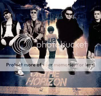
I was just bitching about U2 albuns' covers.

Sorry.

Anyway, I agree with you on the boy's foot
He's in midair, I think.
That's what I think too.
 no worries.