Where the album has a cover? [CONFIRMED]

The friendliest place on the web for anyone that follows U2.
If you have answers, please help by responding to the unanswered posts.
Status
Not open for further replies.
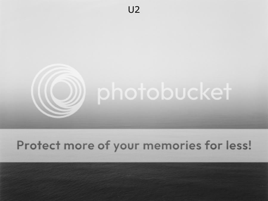
I like it because it's simple, because it's simple in color and message. I don't want a cover that is over-loaded with different images, colors and stuff, that's too much. I like the photograph, just look at the texture of the water in the front. It has something melancholic about it. I would prefer this WITHOUT any writing on it.

BUT there is one thing I'd say against it: It's too obvious. While part of me wants a simple sea/landscape/nature cover, I just think that it would be too obvious in combination with the album title.

But I'd prefer that one over a band photo or any form of visual overkill.

 
Am I the only one who doesn't care for it? Looks like the album cover of Audioslave's Out of Exile taking a nap or something... Kinda boring.
 
I Love it

And as already suggested all it needs is U2 wrote in the middle as the picture tells you exactly what the album is called
 
Wonder if it's a pic of the view Bono has, "at a certain time of day" outside his window, he said in one of the interviews. :shrug:
I don't think there is much to this anyway.
But if I'm wrong, I don't mind the pic.:wink:
 
This cover makes thematic sense, but is it good to have such a black and white color for this album? It suggests the album will be stripped down musically, like it will be a version of Bruce Springsteen's "Nebraska". If the album is as varied and as eclectic musically as it sounds like it will be then the cover needs more color and vibrance to it. Achtung Baby, Zooropa and Pop all had the necessary schemes to their album cover that matched up with the music well.

I like the idea of U2 embracing new art designs for their album concepts, but this cover looks like the cover of an acoustic album. It doesn't seem to make much sense for the new U2 album. If they use this photograph then they need to add something much more to it.

2 things:

I am certain its not black and white. Thats a dark sea, but it isnt black and white.

Also, how does it not make much sense? That comment doesn't make much sense, because it is a picture of the album title. If anything it makes too much sense
 
Oh come on, U2 isn't going to use a second hand image for their cover art. They'll have one specifically shot for them, probably by Anton Corbijn.
 
Just "U2", without the title, like they did with Boy :drool:


nloth2.jpg

Where did you find this picture? Do you have a "clean" version?
 
Maybe it's the lawyer in me coming out, but I'm pretty sure the numerous reproductions within this thread of this Japanese artist's work violates about every right included in the bundle he possesses under American and/or international copyright law as the original artist.

Just throwin it out there....:)
 
Thanks Bathiu!

I was looking for similar stuff but this one seems to be the cleanest. Everything else seem too pixelated if you know what I mean. :wave:
 
that might be my favorite post of all time. it would have been even better if it were a bunny though.
puppies are more personable ... it would be like Bono's fascination with the man, the boy, the fool ... except it would take it even further back ... say to ... a toddler. ... plus a puppy in heaven would be a nice wink to tears in heaven ... eric clapton would approve.

actually ... I'm thinking of contacting U2's design office and see if they can use a Thomas Kinkade painting for the cover.
 
There is the possibility that they will use black/white imagery again as they've done it before consecutively on studio albums; W/UF/JT/RH. Most U2 albums have black/white imagery(7) anyway. I feel they'll go with some colour on this one.

Using that ocean image, though very beautiful, is really boring and already done to some degree. It could be seen as quite passé. Perhaps if they used that a few years ago it would fit. If they were going to use Sugimoto's art then I'd at least go with something completely off the wall like some of those shots from the Natural History Museum.
 
Status
Not open for further replies.
Back
Top Bottom