You are using an out of date browser. It may not display this or other websites correctly.
You should upgrade or use an alternative browser.
You should upgrade or use an alternative browser.
Where the album has a cover? [CONFIRMED]
- Thread starter buzzkill27
- Start date
The friendliest place on the web for anyone that follows U2.
If you have answers, please help by responding to the unanswered posts.
If you have answers, please help by responding to the unanswered posts.
- Status
- Not open for further replies.
LyricalDrug
Rock n' Roll Doggie
If not used for the front cover, this could make a nice back cover picture. Pretty easy to imagine the tracklist, etc., printed over it.
Totally. I was hoping for an exotic, strange, AB/Zooropa-esque cover, actually. This one is a little too soothing for me, but whatever. It'd be awesome as a back cover though.
coemgen
Rock n' Roll Doggie
I like it. It's very different than their last few albums. And it doesn't feature the band!
shart1780
Rock n' Roll Doggie
Um, that's a really good cover. At least it has feeling and atmosphere. Plus it's not cliche'd. That one with the badly photoshopped kid in the football jersey was atrocious.
U2DMfan
Rock n' Roll Doggie VIP PASS
I like the picture itself, I am just hoping for some color.
Add some blue tint to it perhaps? Black and whitesignifies to me more of the same.
A picture of a turd from Larry's dog would be an improvement over the HTDAAB farce.
Also, I tend to agree with Laz, some kind of original work, of some sort, from the U2 camp makes more sense. And I also agree with Bram. Somebody probably invented this rumor all on their own, found the picture and decided to 'run with it'.
I wouldn't be disappointed by this. It would work.
Mostly, I'd like to see them not put their mugs on it.
phillyfan26
Blue Crack Supplier
- Joined
- May 7, 2006
- Messages
- 30,343
Hey, guys, what's the source on this?
rathergoblind
The Fly
I like the picture itself, I am just hoping for some color.
Add some blue tint to it perhaps? Black and whitesignifies to me more of the same.
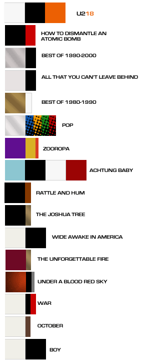
Yeah I agree, be nice to see some color and or colors not used before. below is a chart I used in another thread about the colors used on their past albums.
AchtungDude
The Fly
Hey, guys, what's the source on this?
Does everyone here just skip to the last page or what?

buzzkill27
War Child
Well the one interesting note is that is a photo of The Ligurian Sea(which is part of the Mediterranean Sea) which borders provences and counties in Italy and in France...and in France,specifically Monaco and Eze Sur Mer..where Bono and Edge just happen to have sumer houses ...food for thought,that's all
purpleoscar
Rock n' Roll Doggie ALL ACCESS
As long as the content is great I won't care.
Remember...

Wave after Wave: atmospheric and meditative, Larry's latest video is all sea and sky.
Wave After Wave
Wave after Wave: atmospheric and meditative, Larry's latest video is all sea and sky.
Wave After Wave
atomicman
The Fly
This won´t be it!
Y2K
Refugee
Boring. I'm calling BS on this - I don't think the band would choose something this dull and literal for their cover.
PowerSurge
New Yorker
Way too literal and "expected" for them.
U2 never does the "expected"
watch the actual cover be a mind blowing Kaleidoscope of pictures and colors reminiscent of Achtung Baby or something like that.
U2 never does the "expected"
watch the actual cover be a mind blowing Kaleidoscope of pictures and colors reminiscent of Achtung Baby or something like that.
BEVERLY56
Refugee


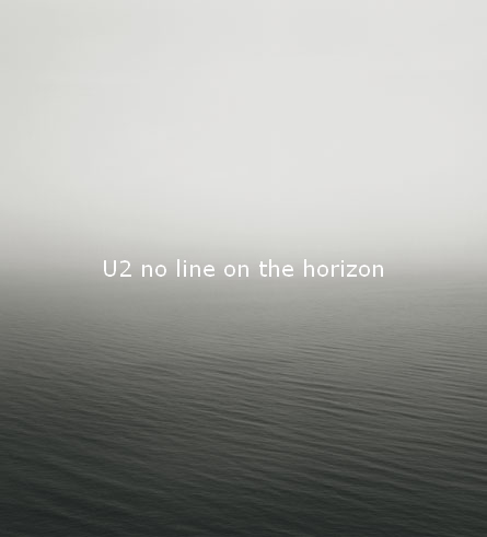
The words themselves make a line though...no good.
Someone needs to photoshop their heads from the Bomb cover and make them bobbing in the ocean.
hate htdab cover!!
seconded
Not keen at all about the cover. It's crap, crap on toast. 
It's as bad as HTDAAB, but in a different way, of course.
What the hell is that obsession with B&W shots?. HELLO LADS, humans can see colours!
By the way, there's an ABSOLUTELY BRILLANT cover post on the fake album art thread!
It's as bad as HTDAAB, but in a different way, of course.
What the hell is that obsession with B&W shots?. HELLO LADS, humans can see colours!
By the way, there's an ABSOLUTELY BRILLANT cover post on the fake album art thread!
phommel
Refugee
Anything would beat HTDAAB.
unbelievable that it is a picture of Anton Corbijn
Miringeltje
An Interferer
From a Univeral press release concerning the single, wasn't the "U" in U2 inversed to make the "N" in No for No Line on the Horizon? I think I recall reading a post on that here. That might be a nice touch for the album cover.
That was an observation I made about the Spanish Universal press release in I don't remember which thread.
Marien
Refugee
Hi, MrMacPhisto!
I don't think it's the cover, but if it is I'd like some colour at least.
I don't think it's the cover, but if it is I'd like some colour at least.
Remember...
Wave after Wave: atmospheric and meditative, Larry's latest video is all sea and sky.
Wave After Wave
I think this looks way better than the artwork shot.
elevated_u2_fan
Blue Crack Supplier
I think this looks way better than the artwork shot.
it looks almost EXACTLY the same!

it looks almost EXACTLY the same!
Except with color and actual sky and actual water and non-digital waves...if you ignore those than maybe they are close.
coemgen
Rock n' Roll Doggie
Boring. I'm calling BS on this - I don't think the band would choose something this dull and literal for their cover.
People were calling BS like crazy when the HTDAAB cover leaked.
LemonMelon
More 5G Than Man
Except with color and actual sky and actual water and non-digital waves...if you ignore those than maybe they are close.
The waves are exactly the same. Only color was added.
People were calling BS like crazy when the HTDAAB cover leaked.
So that makes this one real?
- Status
- Not open for further replies.
Similar threads
- Replies
- 1K
- Views
- 56K
- Replies
- 2
- Views
- 1K
- Replies
- 83
- Views
- 2K
Latest posts
-

-

-
3 Irishmen and a Dutchman Walk Into A Sphere - General Discussion Thread Part III
- Latest: Headache in a Suitcase
-

-

-
-
-
