I really would rather not have any reference to a ".com" on the shirt. Just "Interference" is good, but I can tell you now there's no way I'm ever wearing a shirt that has a website address on it. So I like the ideas that might say "Interference" - just PLEASE leave off the dot com.
(Note that I'm not trying to say "put .com on the shirt and I'm not buying it so that should scare you into not doing it" or anything. But I figure there's got to be other people like me who are wary of buying a shirt with an Internet address on it, but wouldn't mind getting one that just has "Interference" instead. ...If that made any sense at all to you... )
)
(Note that I'm not trying to say "put .com on the shirt and I'm not buying it so that should scare you into not doing it" or anything. But I figure there's got to be other people like me who are wary of buying a shirt with an Internet address on it, but wouldn't mind getting one that just has "Interference" instead. ...If that made any sense at all to you...
) It's never too late to change, Elvis...


 ,
,  . Or maybe you can choose the smilie you want. I think some smilie should be on the t-shirt because everybody here uses them. I really like the username on the back thing! And maybe under it you could have the date the person registered on Intereference, that would be awesome IMO.

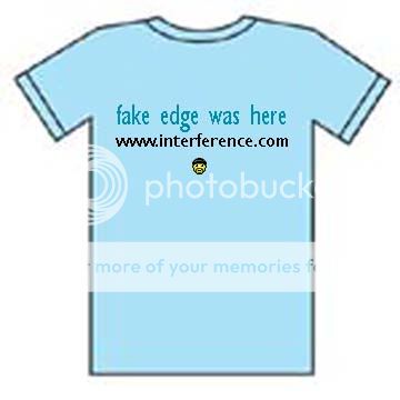
 What about just a plain logo on a blue shirt that looks something like this?


 definately like this idea! ....funny & cool