album cover (official)

The friendliest place on the web for anyone that follows U2.
If you have answers, please help by responding to the unanswered posts.
Oh, and I still agree with the person who originally said they are sitting on top of an atomic bomb.

They are sitting on top of an atomic.
 
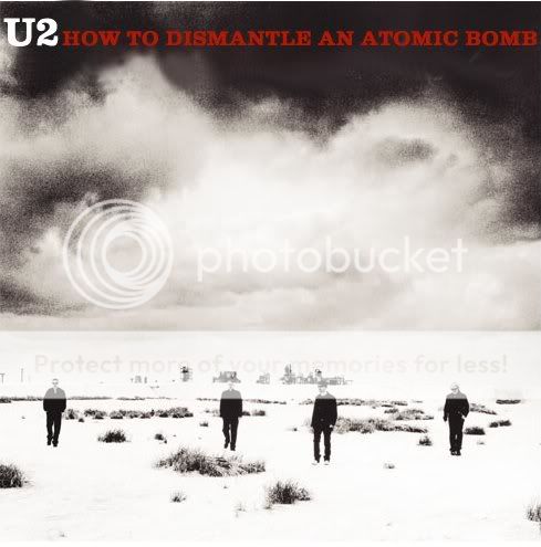
Speaking of which... I don't like it. Anton Corbjin must have taken thousands of pictures of U2 over the years, and about 90% of them must be better than that one. Then there's that huge black border. What is it with that? The whole thing looks like it was put together in 5 minutes by a 14-year-old using photoshop for the first time. I realize that may be intentional, and it might make more sense when seen together with the remaining artwork in the booklet, but I can't honestly say I like it.

Not very likely to grab the attention of a casual shopper, either.

It's not about which picture is "better"... Maybe better for some standards, but then again...
And I don't think it must look like some photoshop-masterpiece that took sveral weeks to do it. Well, if it should, then it surely would, but that's U2 to decide, right? :wink:
I'm happy with this cover. Of course, they could have done it much better, but if it's the best for them, who am I to complain... :ohmy:
 
ramblin rose said:
Oh, and I still agree with the person who originally said they are sitting on top of an atomic bomb.

They are sitting on top of an atomic.

If that's a bomb, then I'm Bono.
They are sitting on a flat surface for goodness sakes.

I don't like it, but I didn't particularly like ATYCLB's cover art. I don't think it's all that important anyways. As long as the music is good, the cover art could be just a plain white surface. OH wait, that has been done, and that was a pretty good album. :)
 
Inner El Guapo said:


If that's a bomb, then I'm Bono.
They are sitting on a flat surface for goodness sakes.

I don't like it, but I didn't particularly like ATYCLB's cover art. I don't think it's all that important anyways. As long as the music is good, the cover art could be just a plain white surface. OH wait, that has been done, and that was a pretty good album. :)


I guess we'll just wait and see. I'll make sure to get back to you on the 23rd.:wave:
 
as long as the music's good, they could put the chicago cubs logo on the front and i wouldnt care

the only way i'd really care is if they put me on the cover :up: otherwise it just doesnt bother me
 
fuchi :(

I can't believe that's the best pic they could get...

I mean. ATYCLB has a very simple design concept but it has a clean, good photography, the right tipography, the paper is great and it has a good balance with the little logos and that stuff...

but this cover... nah... I'm sure they have better images in the same photo contact :eyebrow: . and why did they use that roman font???? the title is long but it seems that the designers didn't do an effort to put it in a more interesting place, with a better, more creative font. and the only relationship between the title and the image are those awfull red lines, put there just to say "this is atomic" (duuh)

:wink: (from a graphic design geek)
 
This isn't a matter about photo quality, I think, it's a design thing, it's a very simple cover, very direct and with a r'n'r-punk feel, I'm starting to dig this cover.
 
Numb1075 said:
Whatever happened to the photos of 4 guys in a swimming pool?

I think that picture was taken for the Vanity Fair article on u2. It appears on the first page of it (big pic) and is done by Corbijn, it's not going to be the album cover once its been in a magazine article.

I like the album cover, very kind-of punk rock, salute to the Ramones thing going on. I think it wont grab peoples attention, but as soon as casual fans walk by and see "u2" and "how to dismantle an atomic bomb," that will be enough.

It's a cool picture, all of the members of the band look cool, especially Edge. The only one who doesnt really is Bono, just because his face looks like its been deflated. :wink:
 
I'm starting to like they idea of the cover more and more... That fact that the band are sitting down connotes selfconfidence (and confidence in the album).

Many have said that what the album cover looks like doesn't matter if the music is good (i don't agree, the cover is important), and this is maybe what U2 are trying to say with this cover.

I'm not totally convinced of my own opinion here...
 
Last edited:
Bono looks pretty cool, but I don't really like it much. Way too simple, and I don't like the black/red color scheme much. I'm more a blue guy.

Also... I'm sorry Edge, but you've looked so much better in other pictures!!
 
RademR said:

I think that picture was taken for the Vanity Fair article on u2. It appears on the first page of it (big pic) and is done by Corbijn, it's not going to be the album cover once its been in a magazine article.


If it's on Vanity Fair, there's no way it will be used for the album cover.
 
jcool said:
is just so..ordinary!

What happen to the creativity?

Zooropa, The joshua Tree, ATYCLB...those are good looking album covers.

True dat.
 
This is by far the worst cover ever and I remain convinced it is NOT real. Edge looks like a perverted stoner.
 
Axver said:
This is by far the worst cover ever and I remain convinced it is NOT real. Edge looks like a perverted stoner.

Again, you mention this. What exactly is wrong with a perverted stoner? :sexywink: :drunk:
 
Jaxx said:


If it's on Vanity Fair, there's no way it will be used for the album cover.

I'm sure RademR is referring to another picture and not the proposed album cover pic.

I'm certain that this is the cover.
 
It's ugly and uninspired.

I particularly dislike the use of red/grey/black as a colour scheme. Instead of the red being striking, it looks cheap and tacky.

October is still worse, yo.
 
On amazon, if you click on where the image of the album cover should be (a white image) it takes you to a page where you get this:

B0006399FS.01.LZZZZZZZ.jpg
 
seriously, the nerve of this band!!! i just can't believe they would give us such a horrid album cover. i am so upset at the thought of this being the album cover. i could design something 10000000x's better than this uninspired, trite, and ugly piece of crap. this is the end of the world. :huh:
 
I like it, but it looks more suited to be a single cover. If this is indeed the album cover, then the reason they probably didn't use the picture on the calendar is that the style if photography is a bit simlilar to that of ATYCLB. It needs to have its own feel to it.
 
WORST ALBUM COVER EVER.

This album cover is soooo much better, I love i and I'm not exaggerating.

majid23 said:
This is made with the photo Anton Corbijn took for the calendar...What do you guys think? (Mr. The Edge, don't hesitate to criticize ;-) )

U2HTDAABcover.jpg
 
maybe i've overlooked, but it would be nice for anyone who actually hates the cover to actually give a reason.
 
Back
Top Bottom