The Worst Uniforms in Sports Thread

The friendliest place on the web for anyone that follows U2.
If you have answers, please help by responding to the unanswered posts.

BoMac

Self-righteous bullshitter
Joined
Aug 2, 2000
Messages
16,897
Location
Soviet Canuckistan — Socialist paradise
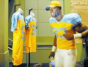
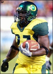
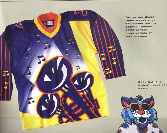
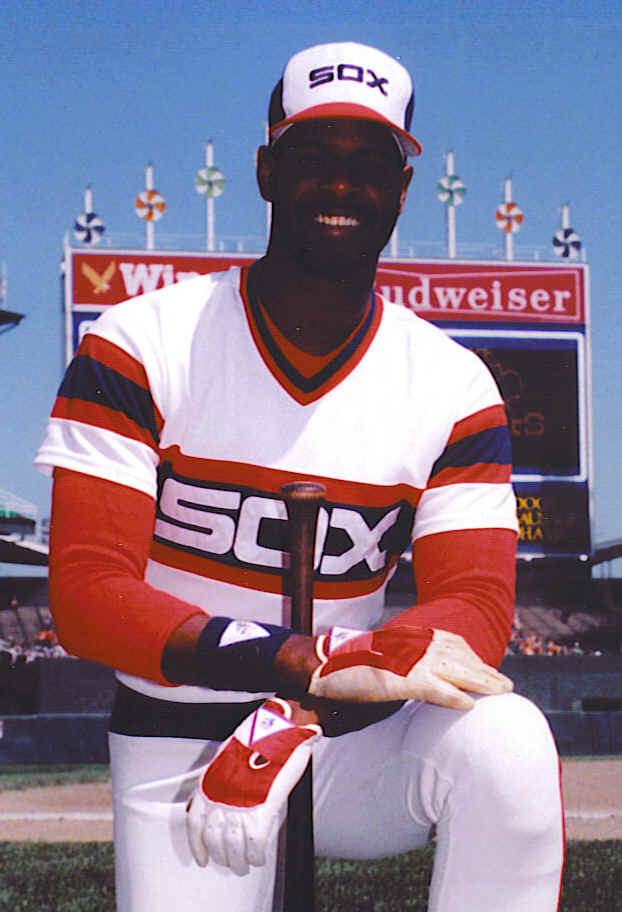
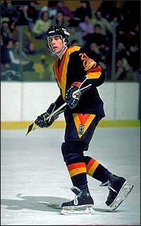
There isn't one definition of what "worst" is. It could be a uniform with a particularly odd color scheme, or even one with a funny logo.

Some logos and uniforms over the years make you wonder what people were thinking.

I, of course, was inspired by recent posts in the NHL thread. So go ahead, post some of the more humorous or atrocious examples of the sports equivalent of a fashion faux pas.


ind05neely02.jpg


RJohnson_Bio.02.gif


I still can't believe we traded him for...Mark Langston. :cry:
 
The Eagles 75th anniversary jerseys they're wearing at their second home game.

20070426_dn_z1eagl26s.JPG


/thread
 
no that was Juventus 2001-2002

this year the uniforms are

first kit- Black and white
second kit- Black
third kit- Blue
 
intedomine said:
Hawthorn wore a nasty blue, gold and BROWN diamond jersey back in a pre-season game in Canberra in 1995 against the Bloods. Was a one-off, but I think they were expecting to wear it more frequently. It was rejected, and if you have a look at it for yourself, you'll understand why.

http://www.bomberblitz.com/~rmered/hawthornPS.htm

Argh, that's hideous. I also forgot the Eagle's vomit-wash away jumper from the start of the decade.

West-Coast-7.gif
 
pic61952.jpg


AS Romas god awful Champions League kit...its like a grey-tan that looks even dirtier when it gets wet
 
The Sad Punk said:


Argh, that's hideous. I also forgot the Eagle's vomit-wash away jumper from the start of the decade.

West-Coast-7.gif

I was furious when they created that. Why break with tradition? Thankfully they revived the old style Eagles jumper (the one they won 2 premierships in) and wear that at away matches.
 
"I clasped my hands in prayer, asking for a million moths to eat my Toronto Maple Leafs sweater."

gartner1lb3.jpg
 
Hmm you guys have put up all the good ones. I rather like the Leafs sweaters but I wouldn't expect a Habs fan to agree :)

Worst logo? Carolina Hurricanes, looks like a flushing toilet bowl...all it needs is owner Pete Karmanos' head in the middle. Yes I'm still bitter...bastard.

Oh the old NJ Devils Christmas-colored unis were pretty lame too, between the green & red and the little guys like Pat Verbeek that they featured it was like Santa's elves on ice.
 
Those Vancouver ones at the beginning are particularly hideous.

But then again there are some great ones too (Canadiens, old Bruins, Red Wings, Blackhawks).
 
Back
Top Bottom