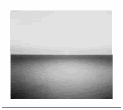
Confirmed Album Cover - Grey Boxes Are? / U2 Album Cover Rip-Off?

The friendliest place on the web for anyone that follows U2.
If you have answers, please help by responding to the unanswered posts.

What are those grey boxes?

  • Boxes = Text Placeholder

    Votes: 88 27.5%
  • Boxes = Something Else Open Interpretation

    Votes: 164 51.3%
  • Boxes = Nothing

    Votes: 68 21.3%

  • Total voters
    320
  • Poll closed .
OH CRAP! I thought this thread was just about the fucking equal signs...sorry :(:(:(:(:(

I just saw the article on RS and thought I should post
 
Sorry.. I had edited the title to include 'U2 Album Cover Rip-Off?' in hopes that would help find it.
 
Here's an interesting interview that was posted on u2.com about the cover design, including the equal signs.

21.01.2009
'Boden Sea, Uttwil'

That's the title of the image by Hiroshi Sugimoto on the cover of No Line on the Horizon. Here's the story behind it.


A month and a half before the release of No Line on the Horizon, with the first single only released to radio this week, there's a surprising level of online chat about... the album cover design. We thought we'd find out a little more.

The artwork, designed as usual by the team at Four5One in Dublin, features a seascape by the renowned Japanese artist and photographer, Hiroshi Sugimoto, who has known Bono for several years. (One of his works hangs in the band's management offices.) One of a few contemporary photographers who continue to work with traditional photographic techniques such as the silver gelatine process and the use of long exposures, the horizon is a central motif in Sugimoto’s 'Seascapes' collection. He's travelled the world to stand on remote cliffs overlooking oceans, capturing the light and atmosphere and the way these effects play in front of the horizon, which always precisely bisects his frame. His work has touched millions and U2 are not the first to see a symmetry between their work and his. We spoke to Shaughn McGrath at Four5One to ask how the design came together.


When did the idea for the album design first begin to emerge ?

The first thing that came about was the title of the record - No Line on the Horizon - that was there from the inception. Bono mentioned it to us last Spring, but at that time he didn't say too much else.

Five words isn't much to go on.

For me it inspired an atmosphere. There's something about how all of us are deeply drawn to looking out across the sea – to the horizon – that draws strong memories and feelings of time and place. There's also this sense in the title of removing barriers, a longing for purity and beauty and the unspoilt... a longing to return to a perfect moment.

Did Bono give you anything else to go on ?

He did, he talked to us about this Japanese photographer/artist who he loved, Hiroshi Sugimoto, and in particular he wanted us to look at his seascapes. That was really useful as it gave us some kind of reference for thinking about the look of the record. At that stage, when a record is nowhere near finished, the band will often talk about ideas they are working on, many of which can change when they actually get nearer the end of writing and recording. But telling us about Sugimoto's seascapes was really helpful, from them we sensed this remarkable synergy with the title of the album.

You decided to work with one particular image, 'Boden Sea, Uttwil', for the album cover.

We felt it was such an emotive image, that there was a natural coherence with the album's themes, that suggested release. And so we set this beautiful, velvet image of Sugimoto's very simply in a white surround.


Does that explain your very spare approach to the album design? It doesn't even have the album title.

It's unusual this but when we had our first meeting with the band to show our design proposal, we showed them this cover execution and they said 'Yes'. I added, 'You know it doesn't even have the title on it?' And they still said 'Yes'. The thing is that each of them in the band is very visually switched on, they all have strong design ideas and I think they realise that there are many ways of giving an album its name, it doesn't just have to be by putting it on the sleeve of the record. It's a cliche but it's true - you can sometimes say much more with far less.


What's the story on the 'equals' sign ?

The equals sign exists on its own, it isn't embedded in the image, but associated with it, on a different plane. It adds to the album's visual idiom. Whatever the culture and language spoken, this universal mathematical symbol is understood, and so it complements the clarity of expression in the image. What we love about the equals sign is the simplicity, the purity - like the title, No Line on the Horizon.


A few days after the album design was revealed, there were some stories online noting that the image had been previously used as an album cover ?

I've just heard about that album and its cover. But I think we're doing something different with Sugimoto's image, something uniquely connected with this latest body of work from U2. And while I'm pleased we've been able to do something that has so few brushstrokes and yet says so much, the response to the design of an album is connected with how well people connect with the album. To give you an earlier example, the first album I worked on with U2 was Achtung Baby in 1991 - that sleeve is widely admired, but probably because the album is so great. People love that cover because they came to love the album. These things don't exist in isolation. It's all connected to the music.


Talking of which, you've heard the finished album now, what do you think ?

I'm blown away by it, and pleased as punch for the band. Their ability to make such beautiful music, with such refreshing, interesting sounds never ceases to amaze me, something that makes the role of the designer all the more challenging and exciting.
 
The equals sign exists on its own, it isn't embedded in the image, but associated with it, on a different plane. It adds to the album's visual idiom. Whatever the culture and language spoken, this universal mathematical symbol is understood, and so it complements the clarity of expression in the image. What we love about the equals sign is the simplicity, the purity - like the title, No Line on the Horizon.

So close. Yet so far from what the equals sign means. :wink:
 
:up:

Thanks for posting, I totally love that concept, especially with the separate equal sign. Also like how he interprets the symbol and the whole artwork and its connection to the music. Great interview and makes me even more excited about the album.

I've experienced today that when you look at the picture long enough and stare at the equal signs, the blurry line behind it simply disappears, I guess that't the optical illusion behind that concept.

Btw, "Bodensee" is not a sea, but a huge lake that is situated between Germany, Austria and Switzerland. I've been there many times. The picture was taken at the Swiss part of the lake. There are already articles in newspapers from that region saying that the lake is shown on the cover of a new U2 album.
 
The album cover is growing on me. I'm still not completely sold on the equal sign, but I don't have such an aversion to it as when I first saw it.

I am hoping that it stays text-free.
 
So close. Yet so far from what the equals sign means. :wink:

Yeah....why didn't he go into the REAL meaning. It sounds like he's purposely avoiding talking in more detail about it. I wonder why.

Usually when you present such a simple design with such an obvious and recognizable symbol to a client, you talk about all possible meanings and interpretations of the image/symbol by the general public...so I'm sure he was part of that discussion. Why didn't he delve deeper in the interview???? bastard!!!! I want to know more :wink:
 
The boxes represent equality. No line on the horizon is a reference to a world without borders. In a matter of speaking ... the people across the ocean from you, across the border from you, across the world from you are equal to you and you to them. We should treat them with respect and "love your neighbor as yourself".
 
The album cover is growing on me. I'm still not completely sold on the equal sign, but I don't have such an aversion to it as when I first saw it.

I am hoping that it stays text-free.

I doubt I will ever be sold on the equal sign; it ruins a great picture for me.

Why would the equal sign be absent from so many of the early graphics -- I previously posted an image taken as a screen shot from iTunes, on Monday, no equal sign, yet today the equal sign is there?

I dont' get it -- its not like the equal sign could have been that tough to add right out of the gate -- you could do it in Accessories / Paint!
 
Story behind the NLOTH cover.

'Boden Sea, Uttwil'

"That's the title of the image by Hiroshi Sugimoto on the cover of No Line on the Horizon. Here's the story behind it.

A month and a half before the release of No Line on the Horizon, with the first single only released to radio this week, there's a surprising level of online chat about... the album cover design. We thought we'd find out a little more.

The artwork, designed as usual by the team at Four5One in Dublin, features a seascape by the renowned Japanese artist and photographer, Hiroshi Sugimoto, who has known Bono for several years. (One of his works hangs in the band's management offices.) One of a few contemporary photographers who continue to work with traditional photographic techniques such as the silver gelatine process and the use of long exposures, the horizon is a central motif in Sugimoto’s 'Seascapes' collection. He's travelled the world to stand on remote cliffs overlooking oceans, capturing the light and atmosphere and the way these effects play in front of the horizon, which always precisely bisects his frame. His work has touched millions and U2 are not the first to see a symmetry between their work and his. We spoke to Shaughn McGrath at Four5One to ask how the design came together.


When did the idea for the album design first begin to emerge ?

The first thing that came about was the title of the record - No Line on the Horizon - that was there from the inception. Bono mentioned it to us last Spring, but at that time he didn't say too much else.

Five words isn't much to go on.

For me it inspired an atmosphere. There's something about how all of us are deeply drawn to looking out across the sea – to the horizon – that draws strong memories and feelings of time and place. There's also this sense in the title of removing barriers, a longing for purity and beauty and the unspoilt... a longing to return to a perfect moment.

Did Bono give you anything else to go on ?

He did, he talked to us about this Japanese photographer/artist who he loved, Hiroshi Sugimoto, and in particular he wanted us to look at his seascapes. That was really useful as it gave us some kind of reference for thinking about the look of the record. At that stage, when a record is nowhere near finished, the band will often talk about ideas they are working on, many of which can change when they actually get nearer the end of writing and recording. But telling us about Sugimoto's seascapes was really helpful, from them we sensed this remarkable synergy with the title of the album.

You decided to work with one particular image, 'Boden Sea, Uttwil', for the album cover.

We felt it was such an emotive image, that there was a natural coherence with the album's themes, that suggested release. And so we set this beautiful, velvet image of Sugimoto's very simply in a white surround.


Does that explain your very spare approach to the album design? It doesn't even have the album title.

It's unusual this but when we had our first meeting with the band to show our design proposal, we showed them this cover execution and they said 'Yes'. I added, 'You know it doesn't even have the title on it?' And they still said 'Yes'. The thing is that each of them in the band is very visually switched on, they all have strong design ideas and I think they realise that there are many ways of giving an album its name, it doesn't just have to be by putting it on the sleeve of the record. It's a cliche but it's true - you can sometimes say much more with far less.


What's the story on the 'equals' sign ?

The equals sign exists on its own, it isn't embedded in the image, but associated with it, on a different plane. It adds to the album's visual idiom. Whatever the culture and language spoken, this universal mathematical symbol is understood, and so it complements the clarity of expression in the image. What we love about the equals sign is the simplicity, the purity - like the title, No Line on the Horizon.


A few days after the album design was revealed, there were some stories online noting that the image had been previously used as an album cover ?

I've just heard about that album and its cover. But I think we're doing something different with Sugimoto's image, something uniquely connected with this latest body of work from U2. And while I'm pleased we've been able to do something that has so few brushstrokes and yet says so much, the response to the design of an album is connected with how well people connect with the album. To give you an earlier example, the first album I worked on with U2 was Achtung Baby in 1991 - that sleeve is widely admired, but probably because the album is so great. People love that cover because they came to love the album. These things don't exist in isolation. It's all connected to the music.


Talking of which, you've heard the finished album now, what do you think ?

I'm blown away by it, and pleased as punch for the band. Their ability to make such beautiful music, with such refreshing, interesting sounds never ceases to amaze me, something that makes the role of the designer all the more challenging and exciting."
 
Hell of a point he made about the AB cover.

NLOTH cover is so open that it will absolutely be judged by the content of the album... 5 years from now the cover quality will be judged almost identically to the general consensus on the album.
 
Personally, I think they should have made the cover as literal as possible.

pictureon1.jpg


Whew. That's better.
 
I don't know what's there not to understand about the guy's interpretation of the equal sign, it makes total sense. It says so much with just two bars. I don't think he needs to go down a list with all possible meanings of that symbol so people can chose which one they like best. Everyone has a different interpretation of it, and like the cover itself, it's open to all these approaches.

I'm surprised no one is talking about the "not embedded" in the cover thing. How will it work? What will it look like?
 
^ Agree. I like artwork that puts me into a meditative mood and calms me down. Since I'm a restless person I don't like art that makes me even more restless. I find black and white pictures very atmospheric and love the simpleness of the concept. That's why I'm having problems with too many visual impressions like on the AB cover, it simply confuses the hell out of me having to figure out every single tiny picture, it just makes me kind of restless. When I paint I also use a very limited range of colors because I don't want to create a visual overkill. Same goes with clothing etc. That's why the album cover is appealing to me.
 
I don't know what's there not to understand about the guy's interpretation of the equal sign, it makes total sense. It says so much with just two bars. I don't think he needs to go down a list with all possible meanings of that symbol so people can chose which one they like best. Everyone has a different interpretation of it, and like the cover itself, it's open to all these approaches.

I'm surprised no one is talking about the "not embedded" in the cover thing. How will it work? What will it look like?

If you're referring to my post I must say that it was a bit tongue and cheek on my part. What I wanted was a little more background on the discussion that went into the initial choice of the = sign and how everyone reacted to it. That's all. I know what it means and understand the various interpretations...I just wanted to read a little more about the behind the scenes stuff like who originally came up with it, what the band thought about it....stuff like that.
 
^ Agree. I like artwork that puts me into a meditative mood and calms me down. Since I'm a restless person I don't like art that makes me even more restless. I find black and white pictures very atmospheric and love the simpleness of the concept. That's why I'm having problems with too many visual impressions like on the AB cover, it simply confuses the hell out of me having to figure out every single tiny picture, it just makes me kind of restless. When I paint I also use a very limited range of colors because I don't want to create a visual overkill. Same goes with clothing etc. That's why the album cover is appealing to me.

You must love Silver Gelatin prints.
 
Back
Top Bottom