Best: Achtung Baby, ATYCLB, Joshua Tree (not the NA one though)
Worst: SOI, Bomb, NLOTH (I don't know why everyone likes this one so much, it's so dull)
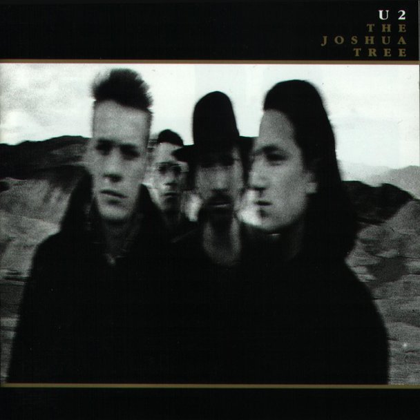
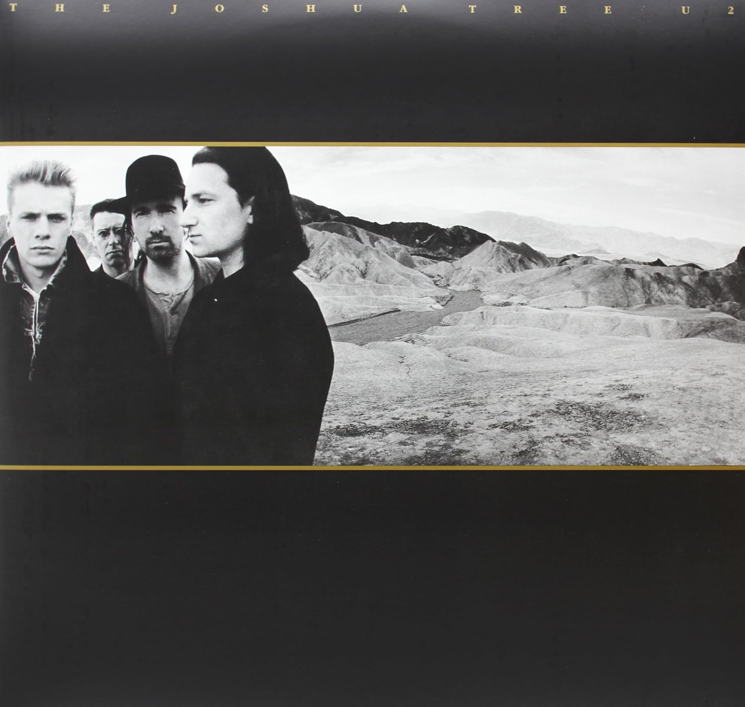
U2 needs to go back to color, this is now 4 albums in a row with too many b&w pics, not enough color.
Worst: SOI, Bomb, NLOTH (I don't know why everyone likes this one so much, it's so dull)
U2 needs to go back to color, this is now 4 albums in a row with too many b&w pics, not enough color.