Opinions appreciated POLL

The friendliest place on the web for anyone that follows U2.
If you have answers, please help by responding to the unanswered posts.

Opinions appreciated POLL

  • Color

    Votes: 45 75.0%
  • B & W

    Votes: 15 25.0%

  • Total voters
    60
  • Poll closed .

Night & Day

Rock n' Roll Doggie, Band-aid
Joined
Oct 17, 2000
Messages
4,528
Location
Where the beer flows like wine...
Dearest Sincere Interferencers:
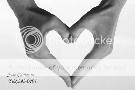
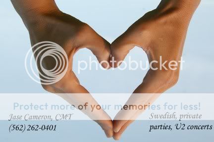
I am making the last cut decision for my Massage Therapy business card.

I am submitting these two final photos to get an idea as to which would be more appealing.
These are my hands, be gentle.

Thank you.

ps.
number invalid.


jasebwhans.jpg


jasehands.jpg


Last edited:
Thanks everyone so far...but don't forget to make a choice by voting with the POLL for either one.

Obviously Bono was an inspiration to me, so i'm not going to take all the credit.

A very special thank you to Michelle for her amazing photographic talents.
 
I'm usually all for black and white, but in this case, I'd go for the color. It is a little more eye catching as an advertisment/business card. I would be drawn toward it in color, where as, I may not see it if it were black and white.

No matter what you go with, I think the idea and design is fantastic. :up:
 
I usually like black & white but some how this picture looks better in color imo. Very nice idea btw. :)
 
ylimeU2 said:
I'm usually all for black and white, but in this case, I'd go for the color. It is a little more eye catching as an advertisment/business card. I would be drawn toward it in color, where as, I may not see it if it were black and white.


:yes:
 
Bonochick said:
Originally posted by ylimeU2
I'm usually all for black and white, but in this case, I'd go for the color. It is a little more eye catching as an advertisment/business card. I would be drawn toward it in color, where as, I may not see it if it were black and white.


:yes:

:yes:
 
The color one looks warmer and more inviting. I would like those hands to massage me.:wink:
 
color - just seems warmer to me.

would go with just the simple "swedish massage" or something like that on the right to keep it very professional. private parties starts to sound :yikes:
 
They both look really nice. I think having the picture on there will grab people's attention. I voted color because I think it will be just a little more attention-grabbing, but I think either design could work for you. Good luck!
 
bayou12780 said:
color - just seems warmer to me.

would go with just the simple "swedish massage" or something like that on the right to keep it very professional. private parties starts to sound :yikes:

Well, i do do private parties, aka massage parties (ie bridal showers, baby showers, casual girl parties and get togethers).
It is very professional, i wouldnt have it any other way
BUT...It was just a sample font my friend who is helping me put on it for a laugh and i didnt know how to delete it.
 
Back
Top Bottom