Songs of Innocence - the visuals

The friendliest place on the web for anyone that follows U2.
If you have answers, please help by responding to the unanswered posts.

LadySpinHead

Refugee
Joined
Sep 4, 2011
Messages
1,784
Location
Faraway, So Close
Thought it would be nice to have a thread discussing the art direction / design / photography / typeface / etc.

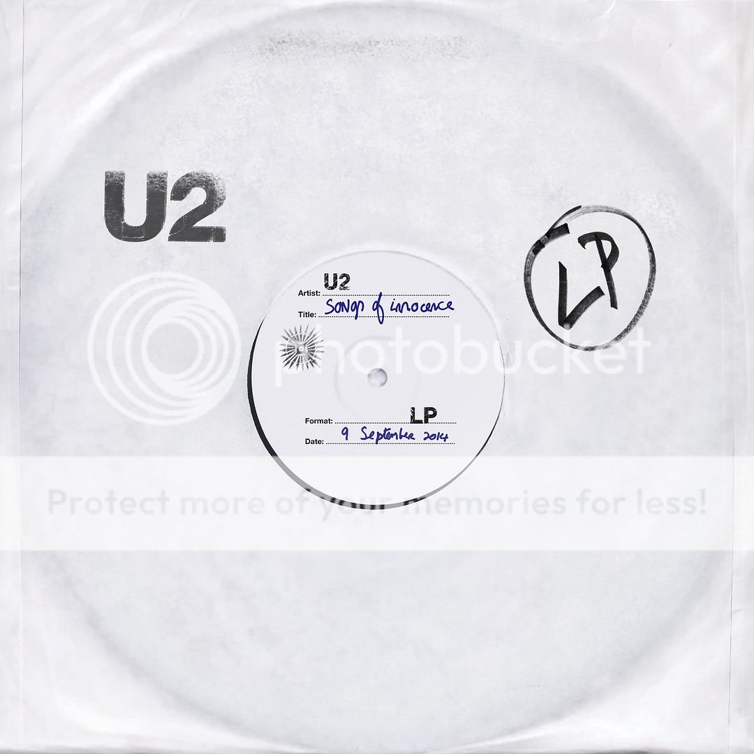
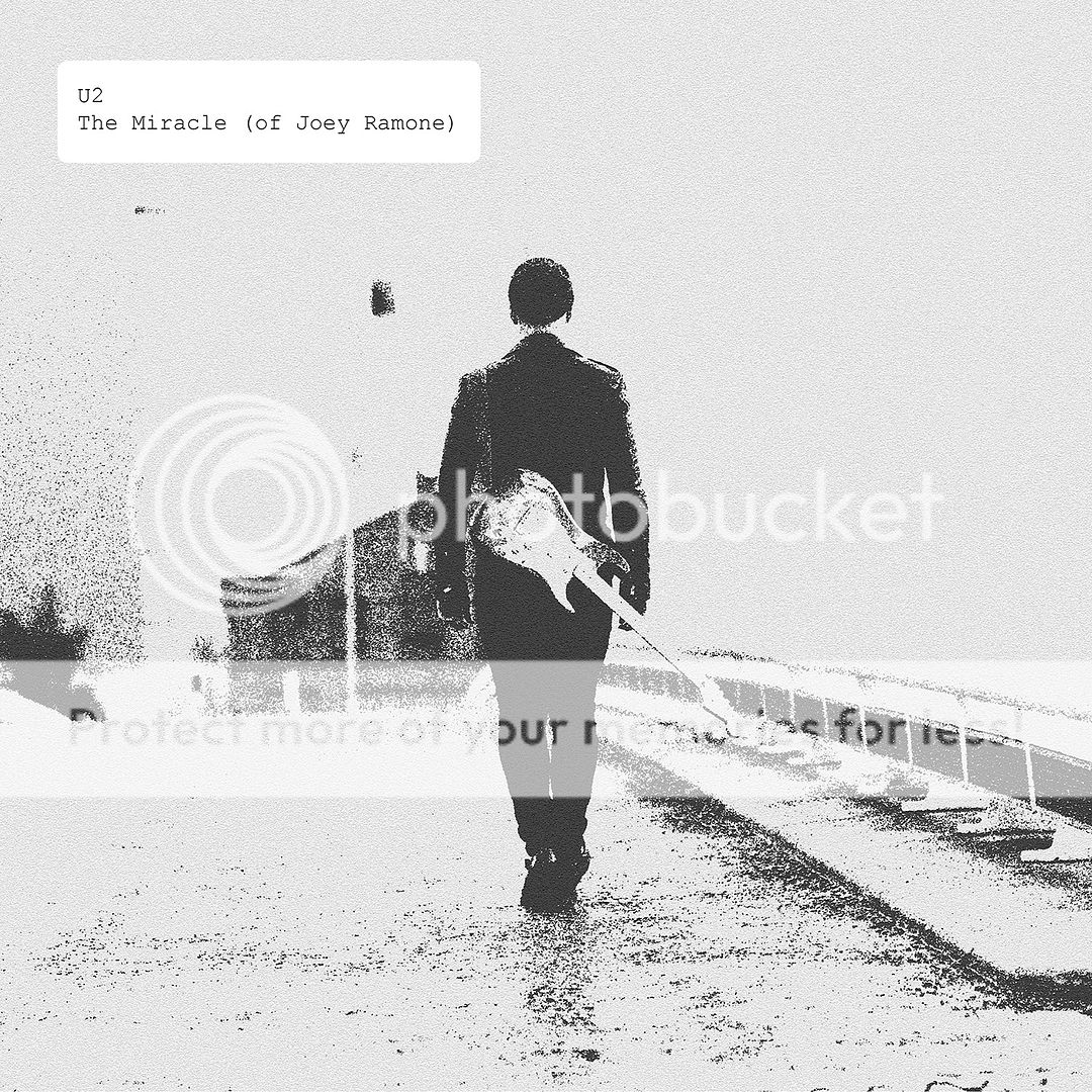
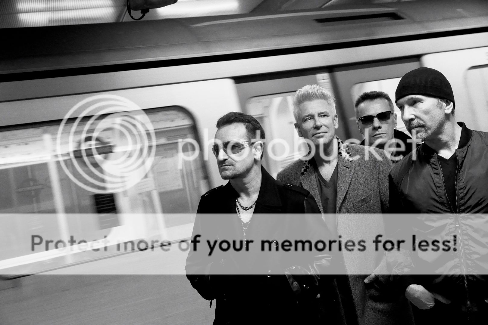
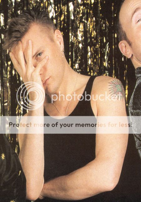
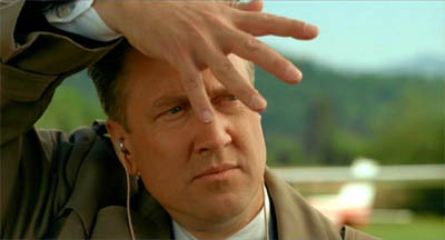
Many thanks to bonocomet for the images, here's just a few to start:


U2_SongsOfInnocence.jpg~original


Of course, my first thought on the cover was, "This has got to be a stand-in." I think that's part of the brilliance of it. It's a very daring album cover, it's something that a designer would pitch but a client (band) would never go for. This took some balls. However, conceptually it's perfect for the theme of the album. Bravo to Averill/McGrath.
 
I think that's part of the brilliance of it. It's a very daring album cover, it's something that a designer would pitch but a client (band) would never go for. This took some balls.

kanye-west-yeezus.jpg


i like the minimalist look as well, but it's not as if it hasn't been done before, and quite recently... so the "ballsy" move probably isn't quite so ballsy.
 
It's not "minimalist", it's a throwback to punk rock and their origins, it has the look of type-written demo recordings.
 
Really liking the visuals. I don't have a problem with the front cover, it's different - compared to their previous album covers.
 
so what's the story with the little image? the Larry tattoo.. what is that supposed to be?
 
Back
Top Bottom