You are using an out of date browser. It may not display this or other websites correctly.
You should upgrade or use an alternative browser.
You should upgrade or use an alternative browser.
Riddle of the = solved ??
- Thread starter Chewbacca
- Start date
The friendliest place on the web for anyone that follows U2.
If you have answers, please help by responding to the unanswered posts.
If you have answers, please help by responding to the unanswered posts.
LarryMullenFan
Acrobat
The cover actually kinda reminded me of this illusion. Funny you post it over hereThere could definitely be some optical illusions at play...not sure what though but when you get these greys together cool shit can happen.
Here is an interesting optical illusion - the A square and B square are exactly the same colour.

") The clue could be that the blocks on the cover _don't_ have the same color.
The clue could be that the blocks on the cover _don't_ have the same color.PowerSurge
New Yorker
Its a Schooner!!
Oh, it's a schooner!
"Ha ha ha ha. You dumb bastards. It's not a schooner... it's a Sailboat."

"Ha ha ha ha. You dumb bastards. It's not a schooner... it's a Sailboat."
OMG!!!!!! It is the Midlifecrisis boat Edge bought some time ago.
HisFlyness
The Fly
Sailboat, sailboat, God damned sailboat...
AiRMaRcI9o0
Refugee
A schooner is a sailboat!

Mountain Dew Ma
War Child

Popmart Shopper
War Child
If you stare at it long enough it says NEXT ALBUM 2014.Just Kidding.
If you stare at it long enough it says NEXT ALBUM 2014.Just Kidding.
Probably not too far off, there.
Acrobatic
War Child
Wait, it's getting clearer. . .Paul is dead. . .
Sorry, wrong band. . .
Sorry, wrong band. . .
gvox
Ghost of Love
Im likely going to get roasted for not being in on the joke
But guys...I don't think this is an equal sign at all, I think it's a deliberate blockage of the actual font and lettering that says, oh, I dunno, something along the lines of:
"U2"
and
"No Line On The Horizon"
In other words, those gray bars won't be on the release...
Sorry if that's been pointed out already...
Im likely going to get roasted for not being in on the joke
But guys...I don't think this is an equal sign at all, I think it's a deliberate blockage of the actual font and lettering that says, oh, I dunno, something along the lines of:
"U2"
and
"No Line On The Horizon"
In other words, those gray bars won't be on the release...
Sorry if that's been pointed out already...
Yes it has been pointed out, and it is still wrong.
PowerSurge
New Yorker
Im likely going to get roasted for not being in on the joke
But guys...I don't think this is an equal sign at all, I think it's a deliberate blockage of the actual font and lettering that says, oh, I dunno, something along the lines of:
"U2"
and
"No Line On The Horizon"
In other words, those gray bars won't be on the release...
Sorry if that's been pointed out already...
Absolutely ZERO chance.
The evidence is in the picture of the boxset that was posted. The equals sign was repeated as a visual element on another part of the set like this:
U
=
2
This leads me to believe that there is no way in hell its a place holder. I think the only reason why people are saying that is because they don't know Graphic Design. You wouldn't do something like that. Using such a dominant visual element, which by the way is very recognizable as an equals sign is just not used as a placeholder for text. If it were there would be an example of said text to show the client what it would look like.
I understand that people are having a hard time wrapping their head around the fact that an album cover doesn't have text on it, but its been done many times before...its nothing new.
Trust me...its NOT a place holder. Its an equals sign...no matter how you look at it.

its not an equals sign either !
they are lines, bars, grey rectangle,
part of the requirments to form the optical illusion I'm talking about.
or maybe it is an equals sign, I'm open to anything, unlike some other
Chewie, you need to lay off the intergalactic hash.
PowerSurge
New Yorker
its not an equals sign either !
they are lines, bars, rectangles,
part of the artwork and requirments to form the optical illusion I'm talking about.
or maybe it is an equals sign, I'm open to anything, unlike some other
I think you need to spend less time hanging around Ewoks.
PowerSurge
New Yorker
its true,
just cause you cant see it, doesn't mean it doesn't exist
(Just like Chewies wedding tackle)
I always wondered how much of a mess Chewy made when he took a shit. Imagine the mandatory security wipes that he'd have to do to make sure he got all of the dingle berries off of his fur.
Needle_Chill
War Child
I always wondered how much of a mess Chewy made when he took a shit. Imagine the mandatory security wipes that he'd have to do to make sure he got all of the dingle berries off of his fur.

 LMAO
LMAOAnd I'm not sure where gvox and Chewy are getting the info, but I think they give a hint about the significance of the = in a new piece in Rolling Stone concerning the album... not sure where it is on the forum.
solemole
War Child
chewie
i see it on your avatar
i see it on your avatar
OrARoundabout
Rock n' Roll Doggie Band-aid
- Joined
- Jul 1, 2007
- Messages
- 4,333
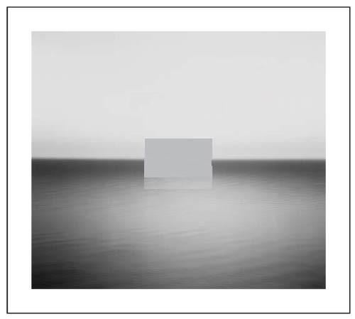
U=2
2 parts, Sea and Sky
...
Thats...king of obvious
2 parts, Sea and Sky
...
Thats...king of obvious
last unicorn
Blue Crack Addict
I don't know why people think there is only ONE interpretation. I believe it is an equal sign AND an optical illusion. The symbol could have a lot of meanings. I really like the new U2 font with the two bars in between, it's also open to interpretation, or, then again, just a new font. And I think the color is totally fitting.
And I think the color is totally fitting.PowerSurge
New Yorker
I don't know why people think there is only ONE interpretation. I believe it is an equal sign AND an optical illusion. The symbol could have a lot of meanings. I really like the new U2 font with the two bars in between, it's also open to interpretation, or, then again, just a new font.
In all fairness, EVERYTHING is open to interpretation....that's obvious. But to disregard any specified meaning because of "Everything is open to interpretation" then you have a world of vagueness and ambiguity. I don't think that's a world many people want to live in. Yes, nothing is truly black and white....but nothing is completely vague and ambiguous either.
You're right, there is no real single meaning....but to say that ALL meanings are equally valid is incorrect. If I look at it and think that it represents two slices of bread in a toaster, that's more about ME and less about the cover, the band, and the music.
Know what I mean?
Mrs. Garrison
Rock n' Roll Doggie ALL ACCESS
innocent_eyes
Refugee
Absolutely ZERO chance.
The evidence is in the picture of the boxset that was posted. The equals sign was repeated as a visual element on another part of the set like this:
U
=
2
This leads me to believe that there is no way in hell its a place holder. I think the only reason why people are saying that is because they don't know Graphic Design. You wouldn't do something like that. Using such a dominant visual element, which by the way is very recognizable as an equals sign is just not used as a placeholder for text. If it were there would be an example of said text to show the client what it would look like.
I understand that people are having a hard time wrapping their head around the fact that an album cover doesn't have text on it, but its been done many times before...its nothing new.
Trust me...its NOT a place holder. Its an equals sign...no matter how you look at it.
Where can I see the new pics? I've been searching the forum with no luck!

Similar threads
- Replies
- 388
- Views
- 11K
- Sticky
- Replies
- 642
- Views
- 33K
- Replies
- 295
- Views
- 11K