popacrobat
Rock n' Roll Doggie FOB
Off topic, but is there even one here anyway? But anyway. #73. Father Brian Eno.
 http://media.u2.com/flash/highlights/FatherBrianEnoDrums.swf http://media.u2.com/flash/highlights/FatherBrianEnoDrums.swf
haha, i think thats better than HTDAAB...

What's sad is that the rest of the album art isn't that horrible. They could have picked any other photo for the cover and it would have been better.
 !!!!!
!!!!!^ thr problem with HTDAAB cover is manyfold:
1. band on cover
2. no theme, just photo of the band (JT at least had a theme)
3. black and white photo to give the impression they have tried
4. generic colouring border (red and black to fool emos into buying it)
5. EVERY ONE OF THEM LOOKS LIKE THEY HAVE ICE-CREAM SANDWICHES IN THEIR BACK POCKETS TO LURE CHILDREN TO THEIR GINGERBREAD HOUSES
6. Edge holding his genitalia
7. Bono's OBVIOUS photoshopped head
8. Larry doesnt look totally bored (obviously very fake)
9. it sucks
10. we waited for years for that
11. it didnt suit the music
12. it didnt suit the title
^ thr problem with HTDAAB cover is manyfold:
1. band on cover
2. no theme, just photo of the band (JT at least had a theme)
3. black and white photo to give the impression they have tried
4. generic colouring border (red and black to fool emos into buying it)
5. EVERY ONE OF THEM LOOKS LIKE THEY HAVE ICE-CREAM SANDWICHES IN THEIR BACK POCKETS TO LURE CHILDREN TO THEIR GINGERBREAD HOUSES
6. Edge holding his genitalia
7. Bono's OBVIOUS photoshopped head
8. Larry doesnt look totally bored (obviously very fake)
9. it sucks
10. we waited for years for that
11. it didnt suit the music
12. it didnt suit the title

6. Edge holding his genitalia

^ thr problem with HTDAAB cover is manyfold:
1. band on cover
2. no theme, just photo of the band (JT at least had a theme)
3. black and white photo to give the impression they have tried
4. generic colouring border (red and black to fool emos into buying it)
5. EVERY ONE OF THEM LOOKS LIKE THEY HAVE ICE-CREAM SANDWICHES IN THEIR BACK POCKETS TO LURE CHILDREN TO THEIR GINGERBREAD HOUSES
6. Edge holding his genitalia
7. Bono's OBVIOUS photoshopped head
8. Larry doesnt look totally bored (obviously very fake)
9. it sucks
10. we waited for years for that
11. it didnt suit the music
12. it didnt suit the title
Bono's head is photoshopped? That's crazy.


Guessing from the seanadsky clip...

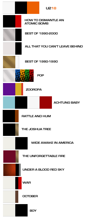
Ok first let me defend myself by saying I do graphic design.... obviously I like U2... and the nerd side all merge on this next subject.
For those who don't have the ability to create an album cover, what about the colors. Sometimes the colors alone picked can really set the mood. Below is a chart with all the albums colors. On some I ignored the photo as a color while others the photo is the color.
What color(s) combos would you think would fit the next album?

I was thinking blue myself.
Here is my color combo. I added a hint of green for accent

Hey that's cool.

