Post your fake album art

The friendliest place on the web for anyone that follows U2.
If you have answers, please help by responding to the unanswered posts.
Here's something I've been working on. I thought I'd go with something completely different than using something like landscapes or having the band in it. It's been awhile as well since they haven't been on a studio album cover.

So I went with beautiful Moroccan tilework, since that country and recording location may be used in the album theme. It's a very simple cover with fading on the left edge, which could imply 'no horizon' and the album title is repeated at the top giving it a contradictory 'horizon'. Also it's difficult to read which I think adds to the effect of 'no horizon'. Perhaps not the greatest album cover but it could be used as a Single/B-Side or other.

2rqd2mr.jpg
 
^This looks nice
The U2 logo is a bit strange (maybe it needs more color or a different font)
But yeah, it looks very nice
 
Thanks! I was trying to give the 'U2' a simple font but I might give it a retro 'War' look with a horizontal line under it and stretch the whole thing out vertically. This way the line under the 'U2' would add to the 'horizon' thing.
 
Yeah, that's a good idea
I don't know why, but the more I look to this cover, the more it reminds me of Achtung Baby :hmm:
 
Here's something I've been working on. I thought I'd go with something completely different than using something like landscapes or having the band in it. It's been awhile as well since they haven't been on a studio album cover.

So I went with beautiful Moroccan tilework, since that country and recording location may be used in the album theme. It's a very simple cover with fading on the left edge, which could imply 'no horizon' and the album title is repeated at the top giving it a contradictory 'horizon'. Also it's difficult to read which I think adds to the effect of 'no horizon'. Perhaps not the greatest album cover but it could be used as a Single/B-Side or other.

2rqd2mr.jpg

I really like this one too, especially for a single/B-side, and yes the only thing I thought could use a bit of change was the "u2". :up:
 
IMG%5D
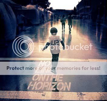
Hmmm...just found this.

CAPA.jpg


IMG%5D

I think this is the actual cover. As for LemonMelon's earlier point that the title of the album is a photoshop job, because all the letters are of the same font, I'd respond, anytime you stencil something with spray paint, the stencils are in the same font, are they not?

This just looks way too professional for it to be fake. I know that there are lots of hobbyist designers out there with lots of great software, and maybe I just WANT this to be the cover, but... hmmmm... it just seems a little too perfect.

And if it's a fake, then well, it's a hell of a great cover. :wink:

It's not that the letters are the same, it's errors in the paint that are exactly the same in each letter. Look at the bottom left of all of the H's for example. There's a small line of missing paint in the same spot on each of them.
 
Yeah, but now that we've seen this they better come up with something that comes close to perfection or we'll be disappointed. :|
 
It's not that the letters are the same, it's errors in the paint that are exactly the same in each letter. Look at the bottom left of all of the H's for example. There's a small line of missing paint in the same spot on each of them.

Do you think the artist that put together the cover actually went and stenciled this on a street and took this picture? Nah, they just use photoshop, too. It was a font they used to put the words on there, so yes, the H's would look exactly the same.

Composite in the letters, the boy, the reflection of the boy, and you're done.

I *really* like it, and while I'm cynical enough to realize it's probably just a great fake, there's a small part of me that sure hopes it's real.

:doh: i am well aware of this, I was pointing the fact out to the poster right above me who said that letters in a stencil would look the same. I realize it's a photoshop.
 
Do you think the artist that put together the cover actually went and stenciled this on a street and took this picture? Nah, they just use photoshop, too. It was a font they used to put the words on there, so yes, the H's would look exactly the same.

Composite in the letters, the boy, the reflection of the boy, and you're done.

I *really* like it, and while I'm cynical enough to realize it's probably just a great fake, there's a small part of me that sure hopes it's real.

Maybe it's real, AND they used Photoshop, since the last time U2 took to defacing public property with spray paint, San Francisco mayor Dianne Feinstein went after U2 for their "Rock N Roll Stops the Traffic" stunt... :wink:
 
It's not that the letters are the same, it's errors in the paint that are exactly the same in each letter. Look at the bottom left of all of the H's for example. There's a small line of missing paint in the same spot on each of them.

Yeah but look at the "N" in "on" and the one in "horizon". They're different!
 
It's not real. I'd be willing to put money on it. Forget the letters, the kid is photoshopped in. You can tell because the lighting is all wrong, and the edges are too crisp. Wouldn't U2 bother to hire a real kid and photograph him, rather than crappily (well, it's not too crappy, it's a good shop job, but still clearly shopped) slapping two photos together?

And besides. It originally surfaced on the Brazilian version of MySpace. Do you really think that's where the first leak of the new album cover would originally show up?
 
Good call! :up:

And that's the first font listed under the "stencil fonts" page on dafont. Whoever made this didn't look very long for the perfect font, it seems. They just picked the first one they saw.


Anyway *continues thought from previous post* Anybody could make a fake album cover and then post it to a fansite (note: I'm not accusing .:MrMacPhisto:. of doing that, but rather whoever posted it to the site he got it from) and say they 'found' it somewhere and think it's the real thing.


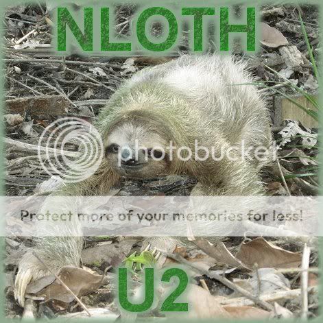
Hay guys! Look at this! I think this is the real album cover! :happy:

nloth.jpg
 
Don't be obtuse, Chass. Everyone got worked up over that cover because it looked too professional to be fan art on first glance.
 
Our hopes = owned.

What do you mean? I have the font file for the ATYCLB and HTDAAB covers, but that doesn't mean those weren't official covers.

Some design person at Four 5 One has to use some kind of font.

I personally am leaning to the three-toed sloth cover as the real thing, though.
 
What do you mean? I have the font file for the ATYCLB and HTDAAB covers, but that doesn't mean those weren't official covers.

Some design person at Four 5 One has to use some kind of font.

I personally am leaning to the three-toed sloth cover as the real thing, though.
But those are professional fonts that must be purchased, aren't they? dafont.com fonts are free shareware fonts, submitted by all sorts of people, amateurs included.
 
I'm pretty sure no one EVER suggested it was the real thing, just that the source of who made it was unknown, and we here at interference speculated our very hardest.
 
Back
Top Bottom